A-Renting

A-Renting
Oudenaarde
2025
Cooling rental
- Brand strategy
- Brand design
- Print & signage
- Photography & video
- Copywriting
- Marketing continuity
A party rental business wanted to become a container rental business.
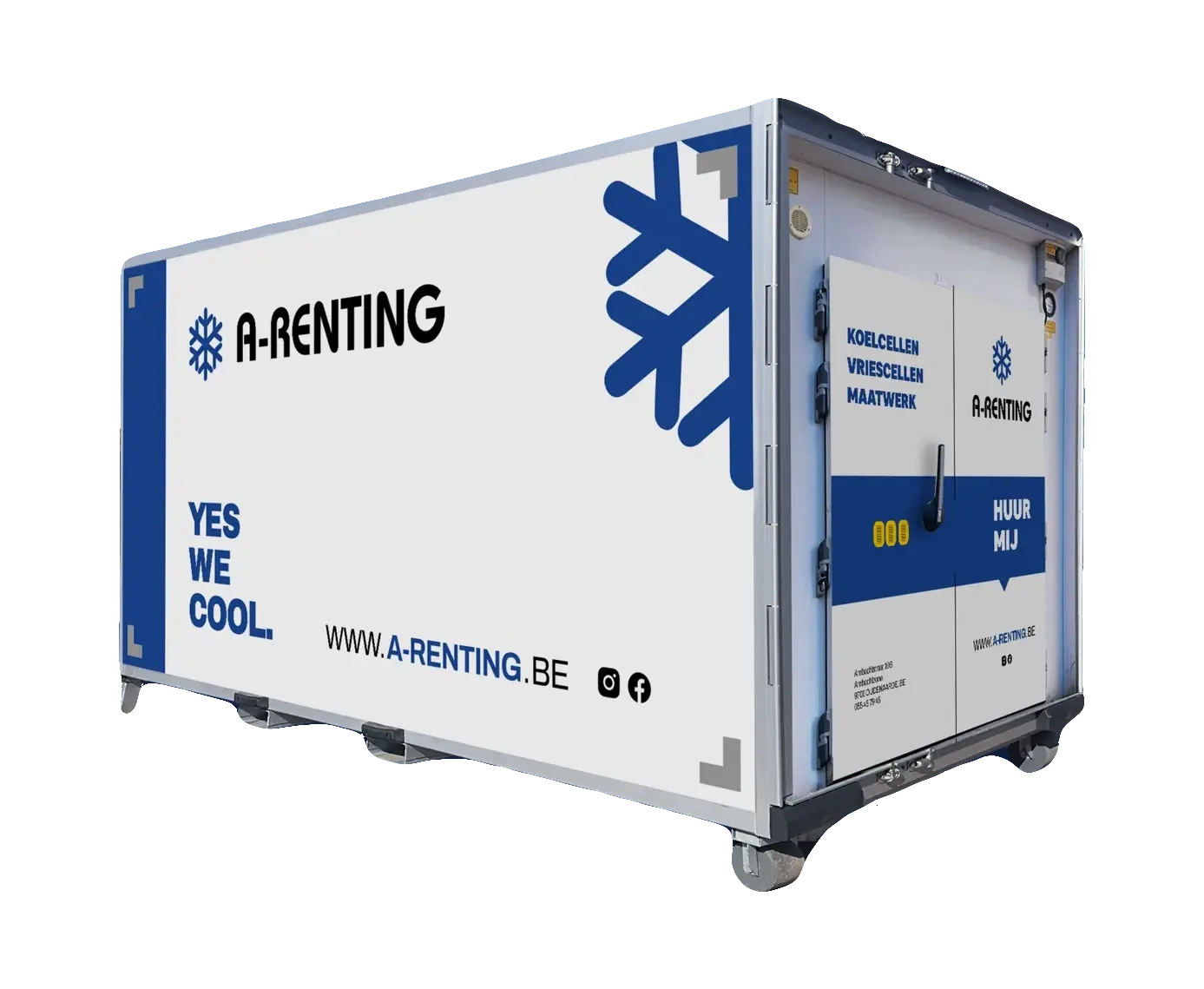
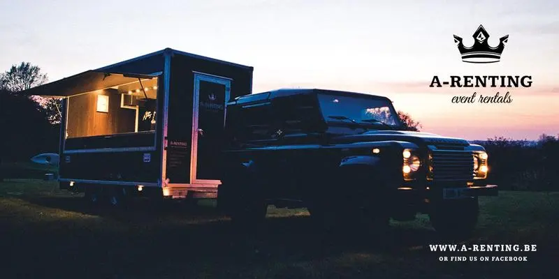
A-Renting rents mobile cooling and freezing cells across the Benelux, from a single day to five years. The business grew up around events and festivals, the kind of last-minute cold storage a bar or a food stand needs for a weekend. Good work, but a reputation stuck to it: party rental.
The real demand was moving somewhere heavier. Supermarkets, hospitals, public services, sectors where a cold chain cannot drift and a supplier gets judged on whether it looks like it can be trusted with one. A-Renting could do that work. Nothing about how they showed up said so.

On white
On mist
On brand blue
On black
Archivo
Bold 700 · Black 900 (all caps)
Editorial alternate: Inter
- Display48px · 8002°C IS EFFECTIVELY 2°C.
- Heading28px · 700COOLING YOU CAN TRUST.
- Body17px · 400Integrated service and a 24/7 human who watches and fixes, so the guarantee is a person, not a promise.
“Every container that got wrapped came out a little different, killing the brand softly over the years.”
A previous supplier had handed A-Renting a logo, not a brand. Each container wrapped since had come out with slight variations, so the identity drifted a little further every year. Dima came to us through a mutual acquaintance for something small: a touch-up of that logo, so he could start profiling the company properly.
The touch-up did not survive first contact with the real question. To chase regulated, high-trust clients, A-Renting needed to look like a company those buyers could hand a medical or food cold chain to. That is not a cleaner logo. That is a brand, and a plan to roll it out across a fleet that was already half-wrapped.
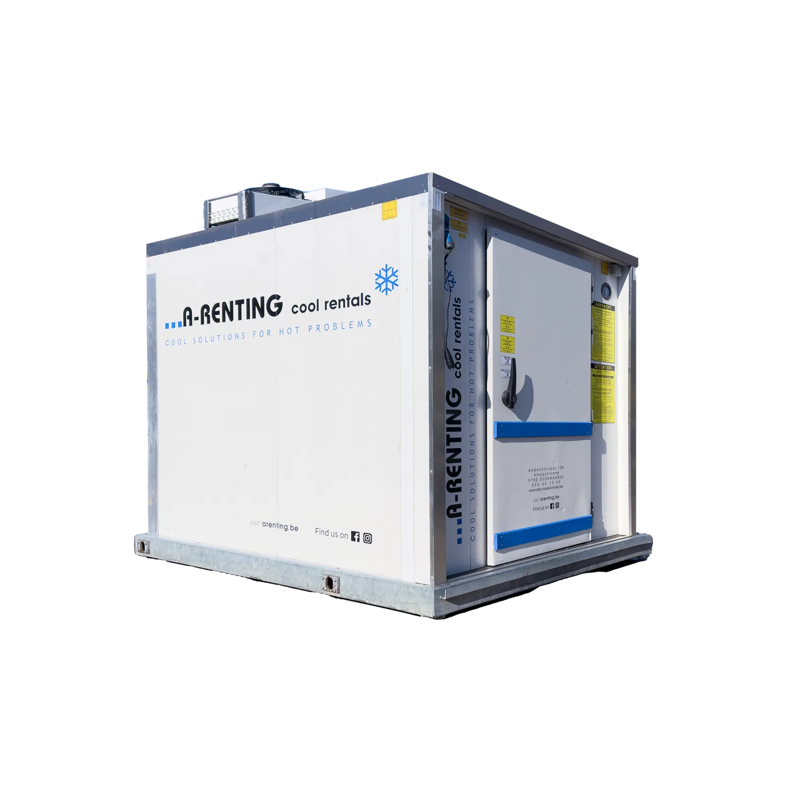
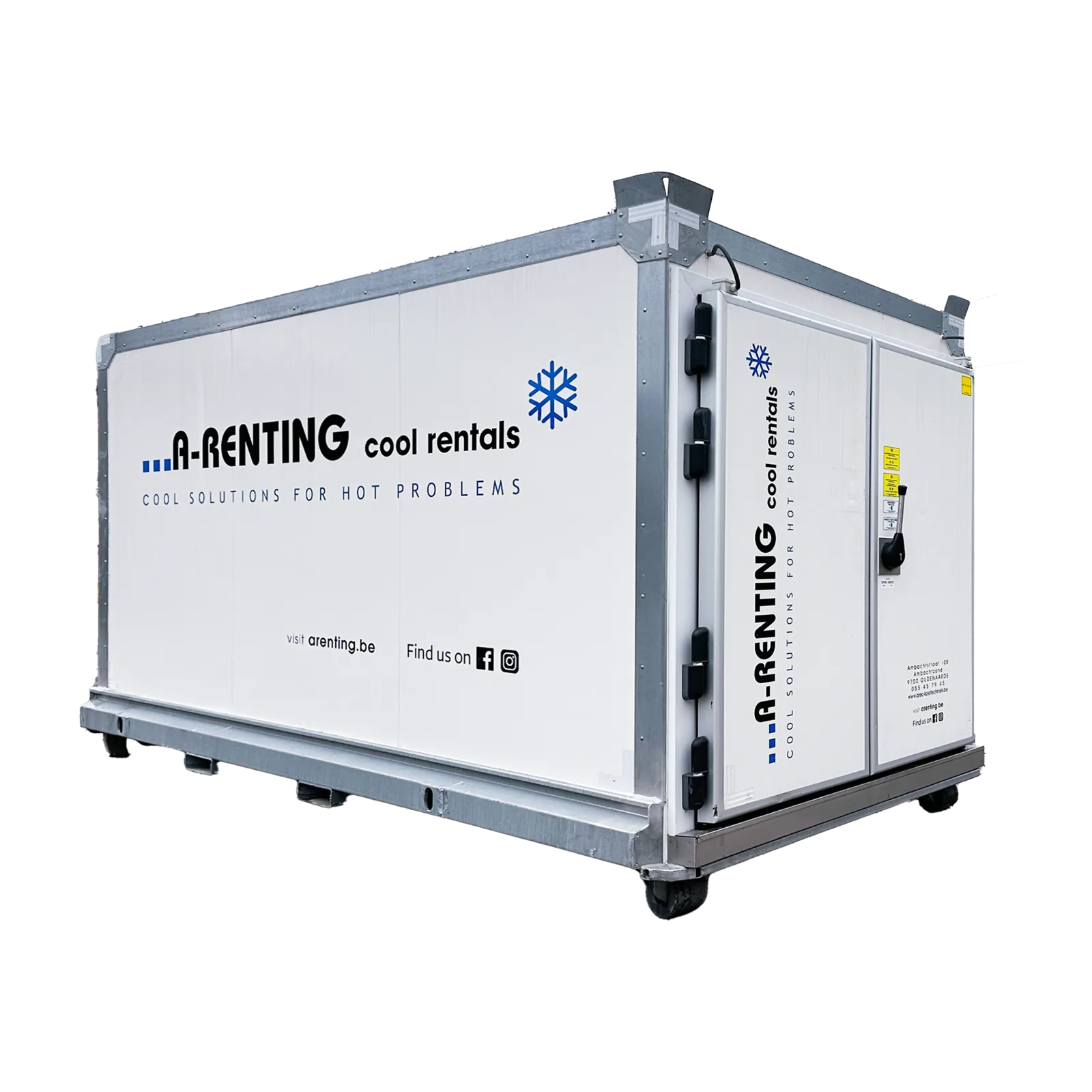
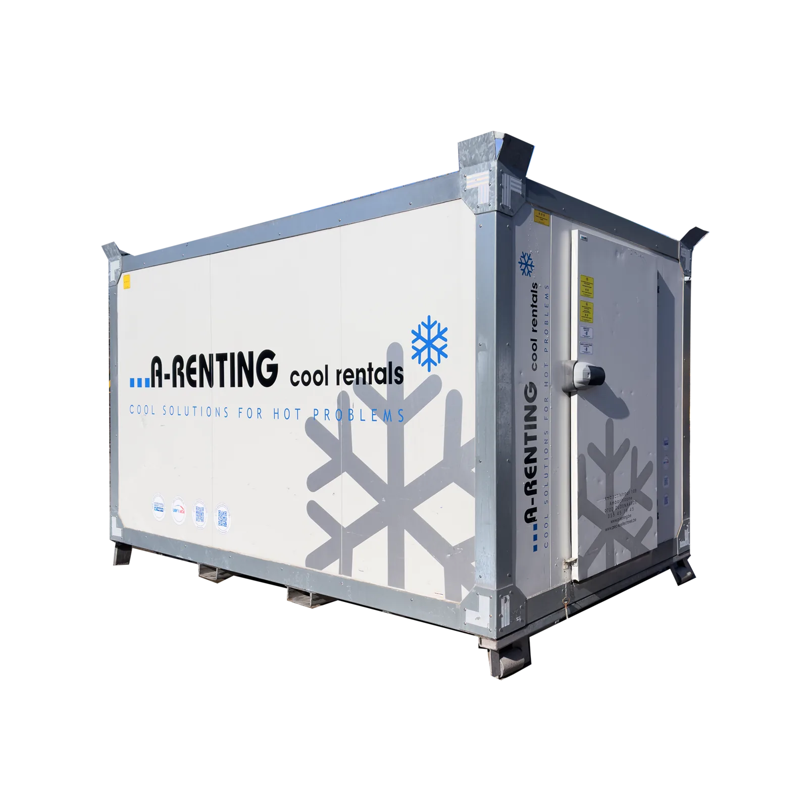
A soft phased-out brand transition.
The proof point is literal: with A-Renting, 2°C is effectively 2°C. That reliability is why their cooling is cleared for heavily regulated sectors like food and medical, and it is backed by integrated service and a 24/7 human who watches the units and fixes them, so the guarantee is a person, not a promise. We made that the spine of the brand and built a dedicated page that walks a buyer through exactly how the watching and fixing works.
The logo touch-up became a rebrand the moment the new website asked what A-Renting actually stood for. We did not torch what existed and we did not swap everything at once. Instead, from that point on, every new thing lands on brand: containers freshly added to the rotation carry the new identity, fresh print and signage go out in it, and the already-wrapped units live out their cycle. Piece by piece the fleet converges on one look, with no jarring overnight switch, no budget bonfire, and no identity gap while the brand grows up in public.
Deep blue for cooling, pushed to a darker, modern shade so it reads current instead of corporate-cold. Archivo set in all caps for the headlines, chosen to echo the hard edges and the robustness of a shipping container. The system is built to look like something you can trust with a load that is not allowed to fail.
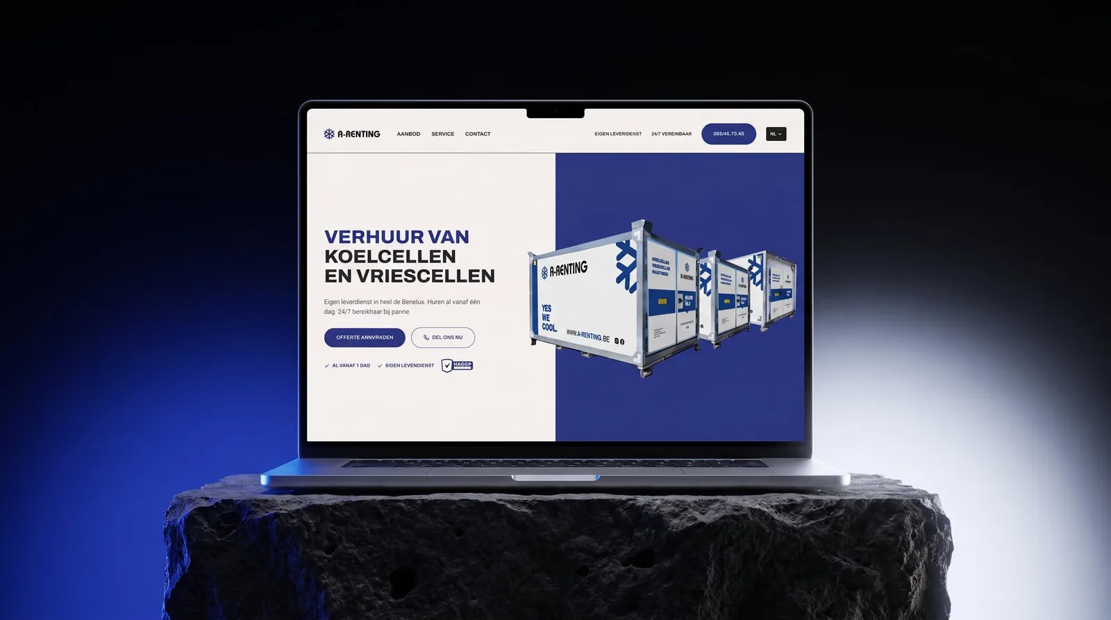
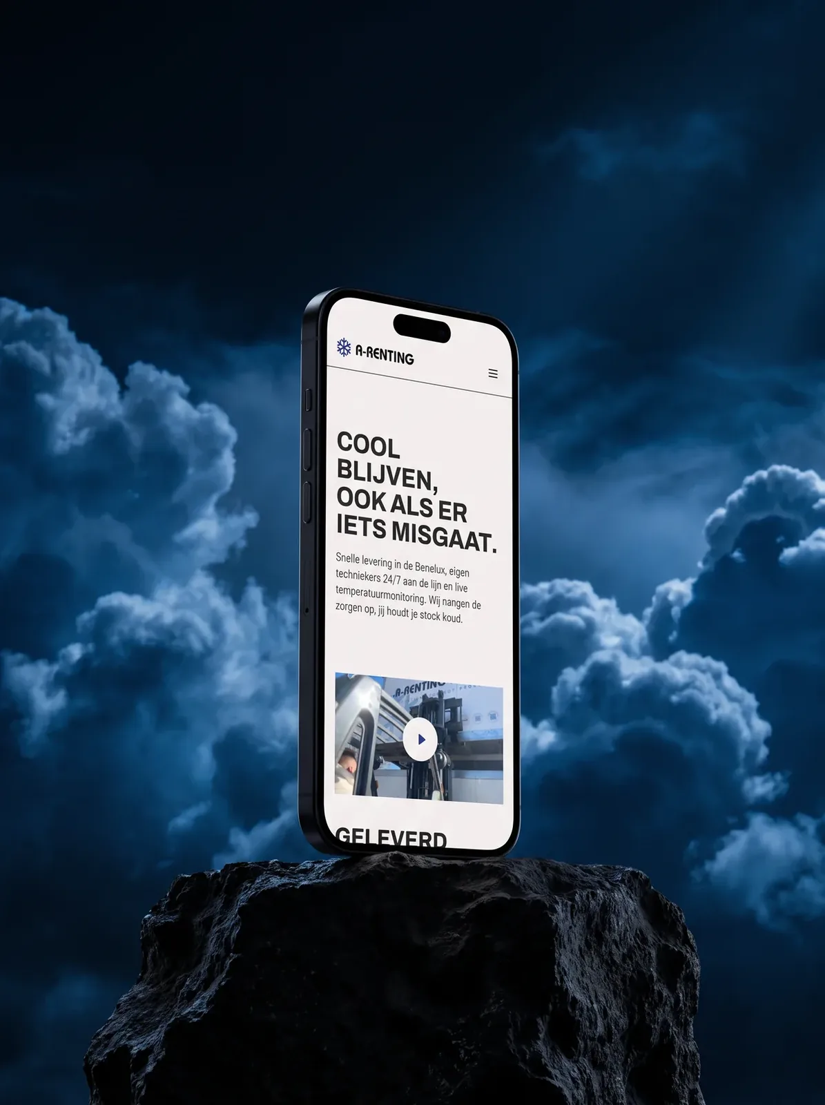
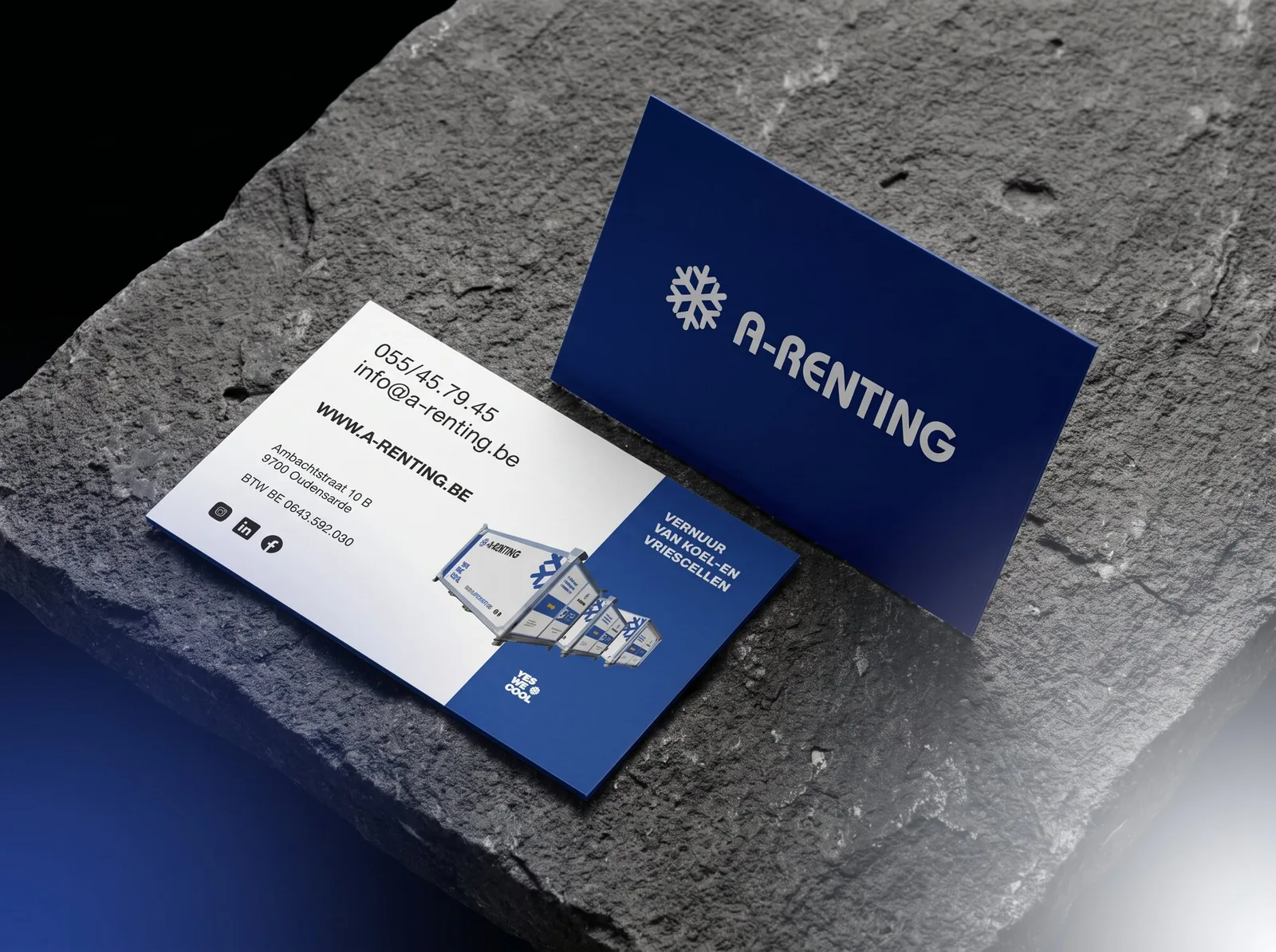
The marketing grew with the fleet.
The work did not stop at the rebrand. We stayed on for the ongoing marketing and the strategy calls about where the brand moves next: the campaigns, the socials, the email campaigns, the seasonal reels shot on site. Whatever pushes the business forward.
Year after year A-Renting grew, and the brand grew up with it. The fleet is up around 40 percent, and the mix has shifted away from one-off private hires toward long-standing, high-level recurring clients: Ahold, the city governments of Ghent and Oudenaarde, Tomorrowland, and contracts with national government institutions and retailers.
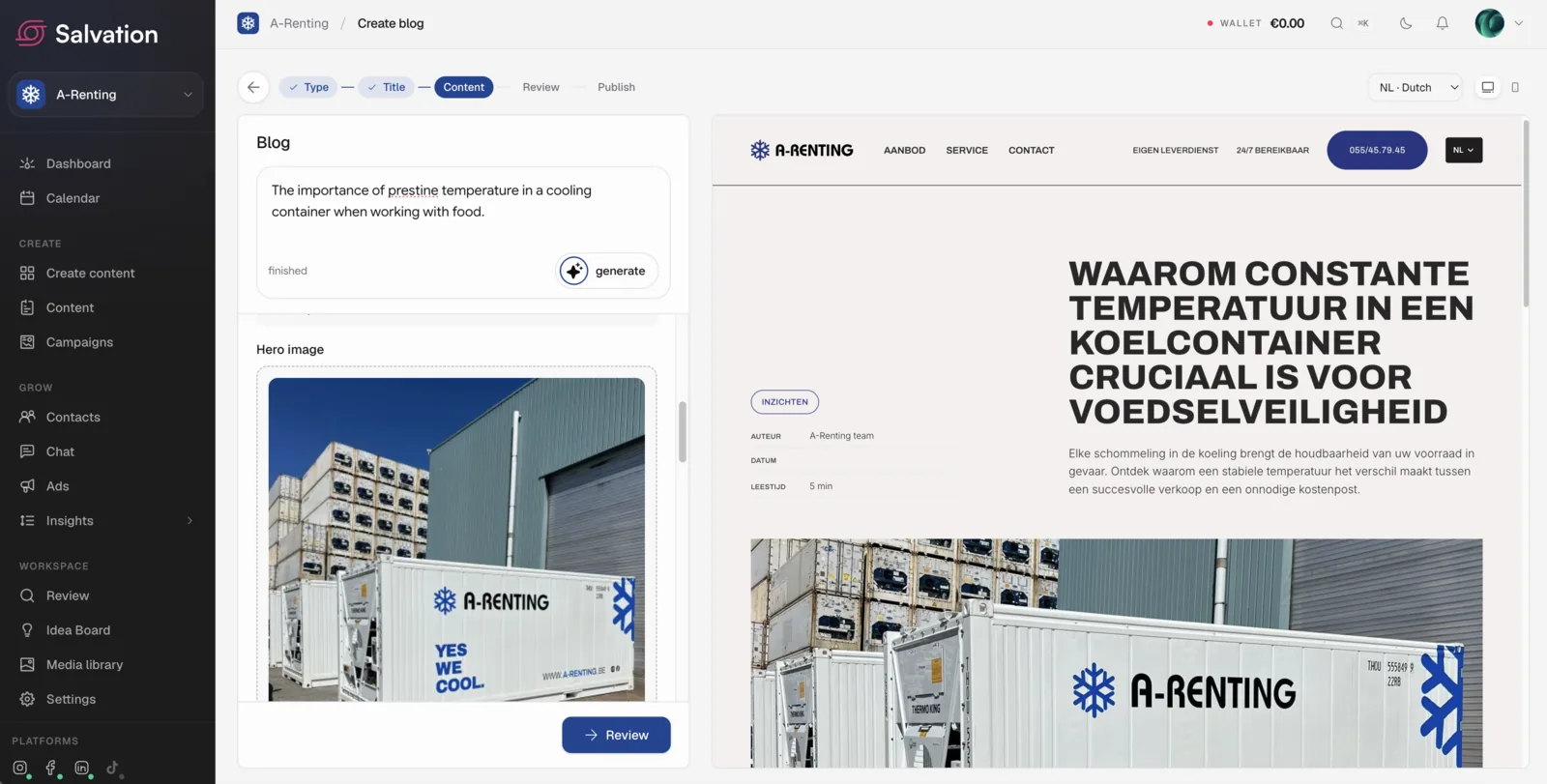
The studio A-Renting calls for whatever comes next.
Once the brand existed we stayed on as the team Dima calls when something needs to look right or simply work better. Not only design. Whatever moves the business forward.
- 01
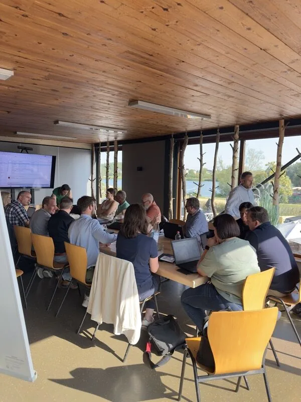
“Can you shoot our meeting with Delhaize for socials?”
We sent someone over and turned the day into a LinkedIn post.
- 02
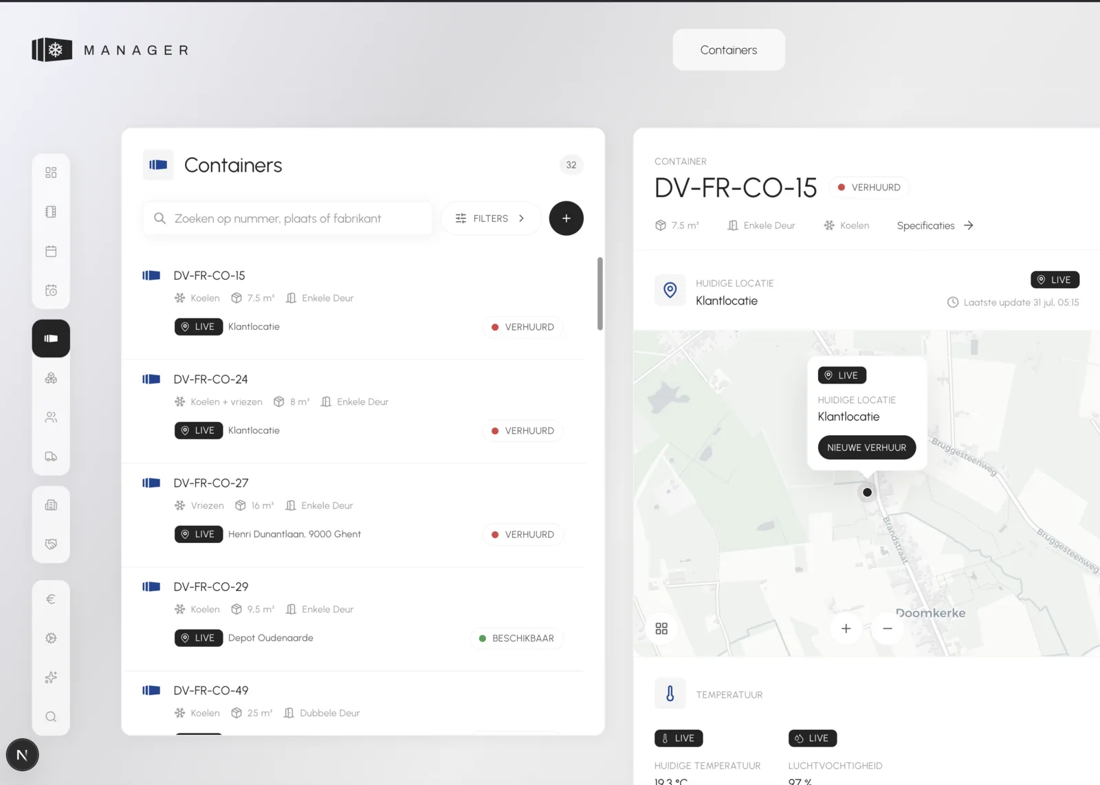
“We need more automation in the business.”
Our sister agency built them an AI-powered application.
Visit Arkalion - 03
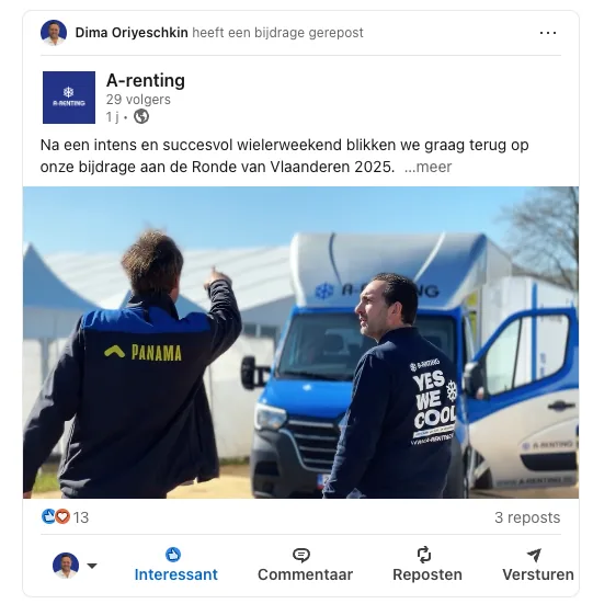
“Can you quickly shoot an improvised video of a container delivery?”
We sent someone out, cut the edit, and published it.
Oh Lord turned us from a party-rental outfit into a company that governments and laboratories trust, whilst maintaining our event clients.

Dima Oreyeschkin
Owner, A-Renting
Grow without losing who you are.
A-Renting shed the party-rental label and became a supplier regulated clients trust, without torching the fleet or the budget to do it. Tell us where your reputation is holding you back, and we will show you the way up.