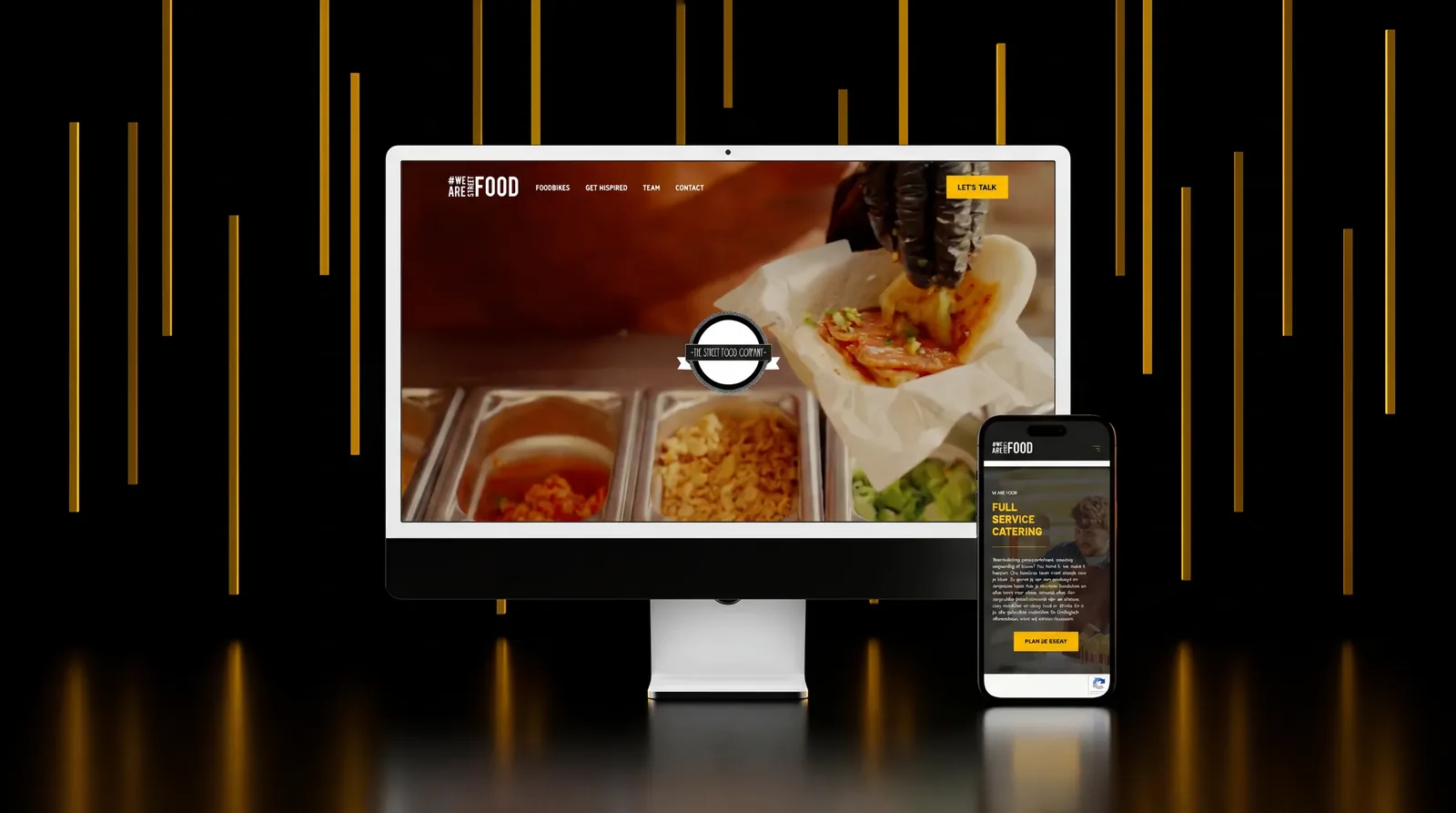
The brand got made along with the website.

The Street Food Company
Ghent
2025
Hospitality
Studio HIT
Copywriting
- Website
- Brand design
- Brand guide (living)
- AI chatbot
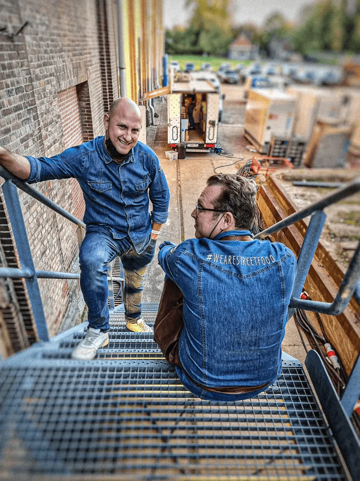
It was already stitched on the back of a denim jacket.
The Street Food Company caters events across Belgium. Long days, other people’s venues, one evening that cannot be redone. The clearest thing about them is not on any letterhead: #WEARESTREETFOOD, embroidered across the back of a denim jacket, years before anybody wrote a rule down about it.
So the brand was not missing when they came to us. It existed the way things exist in a company that has been doing the work for a while, in what people wear and how a night with them goes. It had just never been written anywhere, which is fine until the moment you need something built. They found us through a copywriting agency we work with, who had the words ready and needed somewhere to put them.
Picking up with what was there already.
On white
On yellow
We kept the logo as is, so not all food bikes needed new stickers.
The yellow was already theirs. Nobody had ever written down which one.
Barlow
Black 900 · Semibold 600 (all caps)
Section headings: Patua One
We picked a font for the website that is powerful and playful at the same time, and works with the New York vibes the brand already had going for it.
- H168px · 900FULL SERVICE CATERING.
- H258px · 600#WEARESTREETFOOD
- Body base16px · 300Headlines stay uppercase. Body copy stays cased and Light, so a paragraph still reads like a person wrote it.
“We need a new website.”
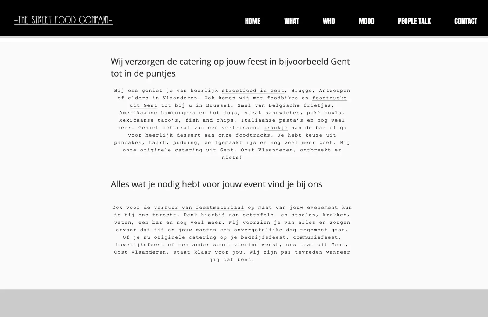
That was the brief, and it was an honest one. What they had was a site that talked to search engines rather than to people: paragraphs of centred monospace, every other phrase a link, Gent and Brugge and Antwerpen worked into the same sentence in the hope that one of them would land. Somewhere under it was a real company that feeds hundreds of people a night.
The harder part sat underneath. To build a site you have to decide things a logo never forced anyone to decide: which yellow, which type at which weight, what a heading sounds like, what happens when the mark has to sit in a corner two centimetres wide. Nobody had ever had to answer those questions, because until then nothing had asked them.
The brand got settled while the website got built.
So we settled them, using what was already there rather than starting over. The yellow, the near black and the cream were already theirs. What did not exist was the system around them: Barlow black and all caps on every headline so the loud parts stay loud, Prompt in Light and cased underneath so a paragraph reads like a person wrote it, Patua One holding the section headings in between. Rules instead of preferences. The site became the first place those rules were enforced rather than remembered, because a page renders the same way every time whether or not anyone is paying attention.
The logo argument was the real one. The full mark is a crest, and a crest is beautiful at poster size and mush at thumbnail size. Replacing it meant re-wrapping a fleet of foodbikes that were already out working, which is a lot of money to spend on a problem nobody was complaining about. So we kept it, gave it the room it needs where there is room, and drew a short form for everywhere there is not: #WEARESTREETFOOD. It goes on the corner of a page, the back of a denim jacket and anything too small for the crest, and it says the same thing in a fraction of the space.
Everything was written down as it was decided, which is how a living brand guide ended up existing for a company that came in asking about a website. It is the reference their own people work from now, and it is the reason the next thing they make can match the last one without anybody having to guess.
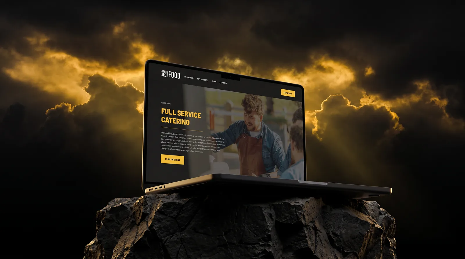
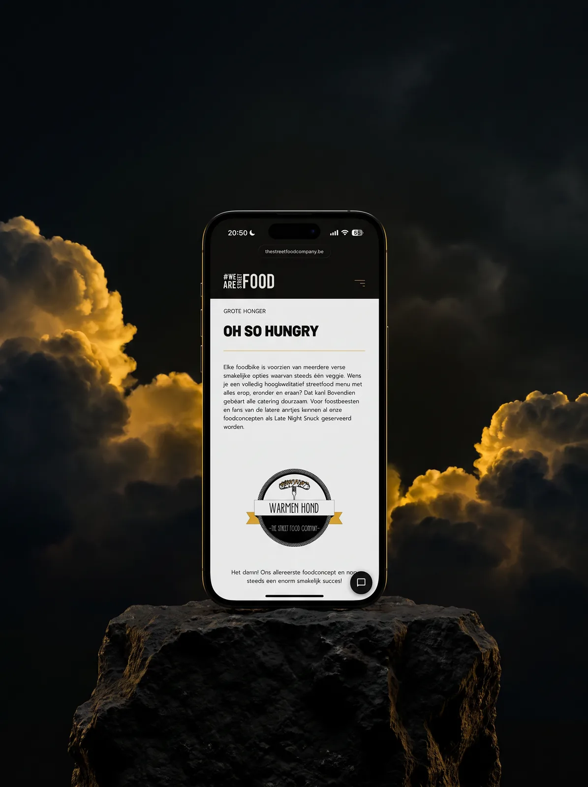
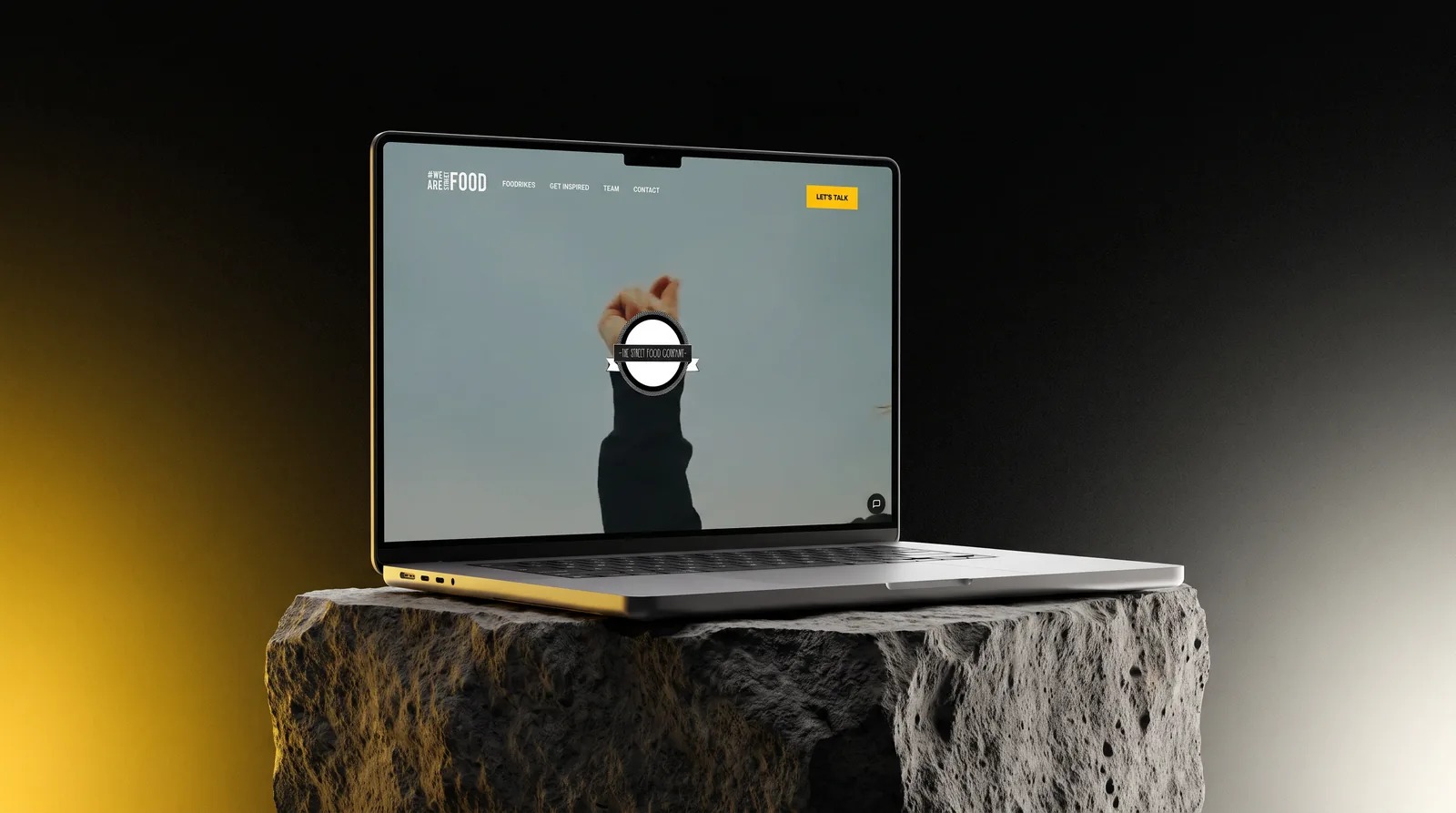
A brand that is allowed to stay a little bit street.
Today the brand lives as an ongoing thing. The website is the clean part, and deliberately the part we made enforceable: a page renders the same way every time, the folder library and the chat assistant keep running whether or not anyone is watching. Everything around it is made by a lot of different hands.
That is not a problem to solve here. Street food is trestle tables, a hand-lettered board, a queue in the rain, and a bit of clutter is the appeal rather than the failure. So the guide is a floor, not a cage. Theirs to run.
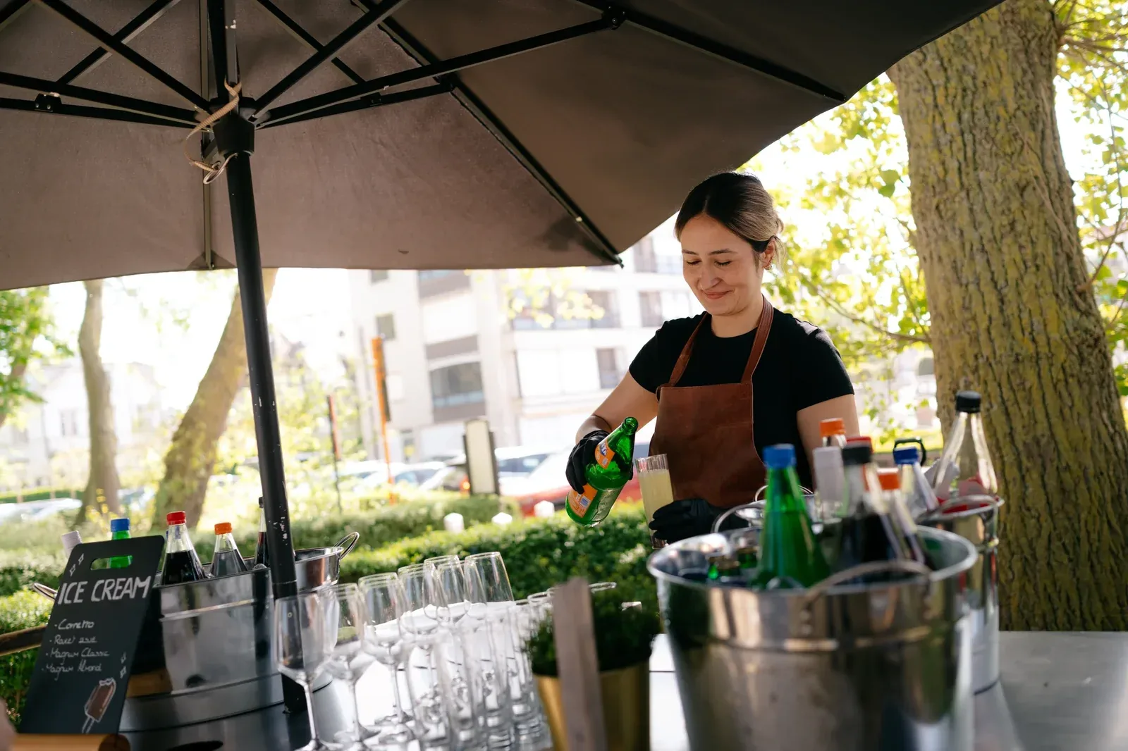
When “the site” needs something new.
The website is the part of the brand that keeps moving, so it keeps getting asked for things. Most of them are not design questions. They are whatever the business needs that month.
- 01
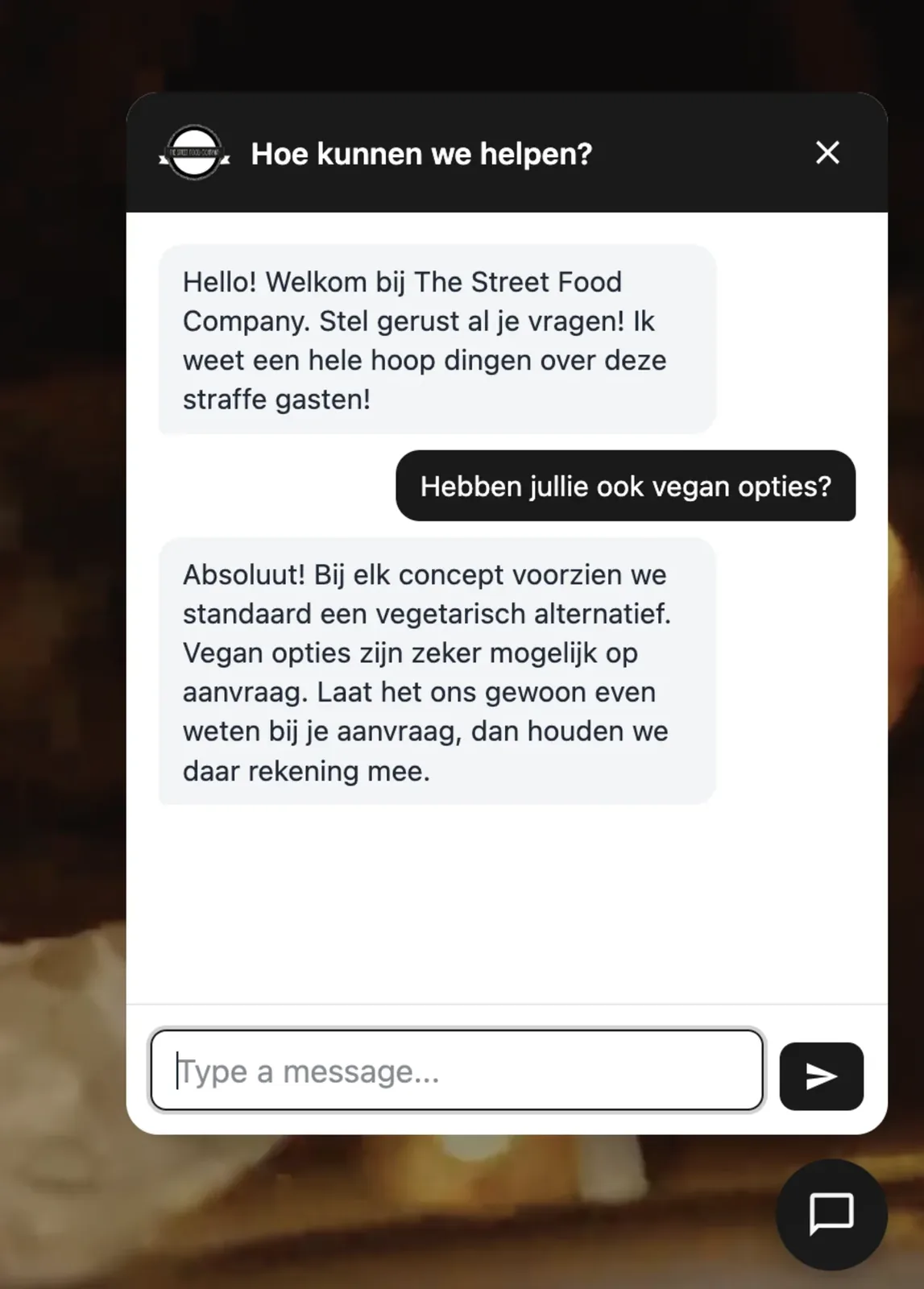
- 02
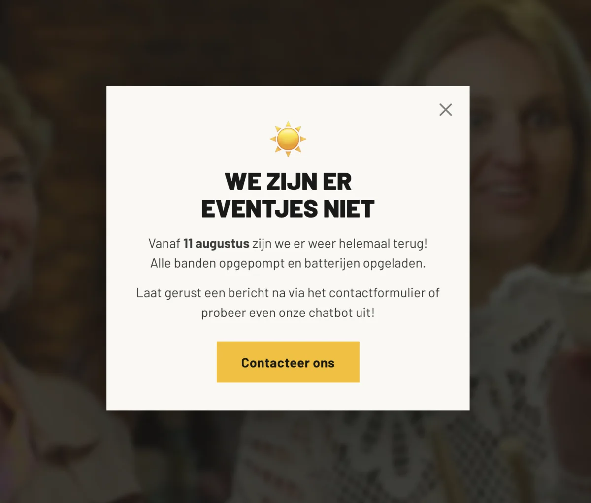
“Can you put up a holiday banner?”
A notice they switch on themselves, with an end date so it takes itself back down.
- 03
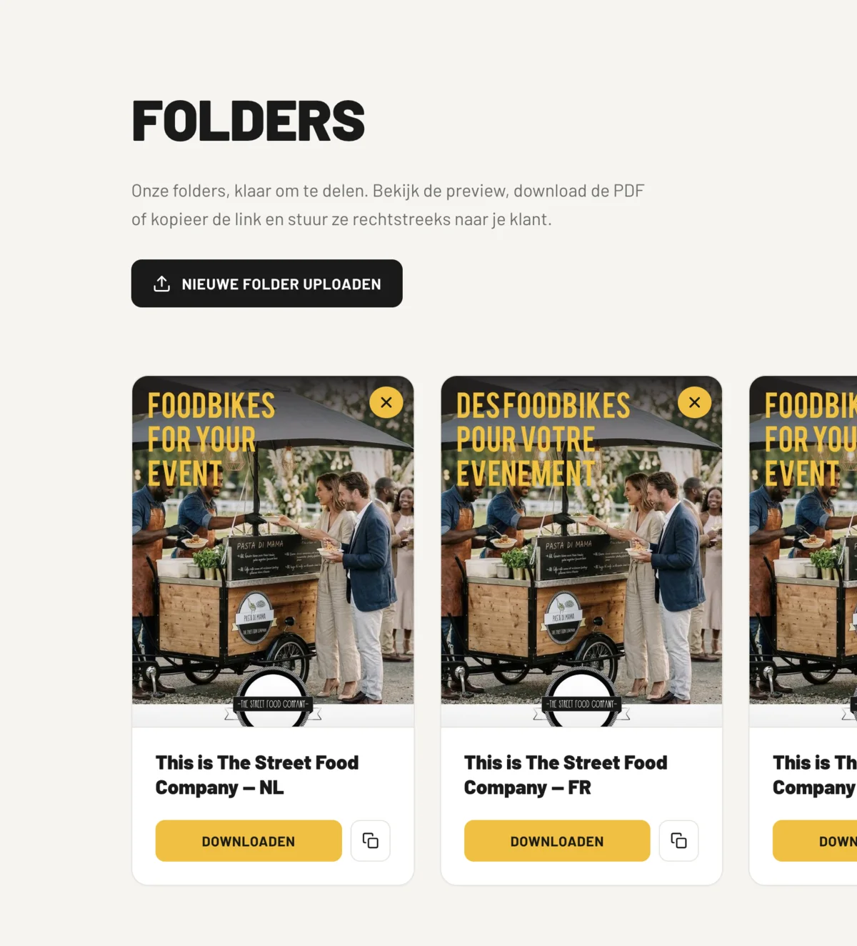
“Can you make sending folders easier?”
A folder library. They upload a brochure and send the client the link.
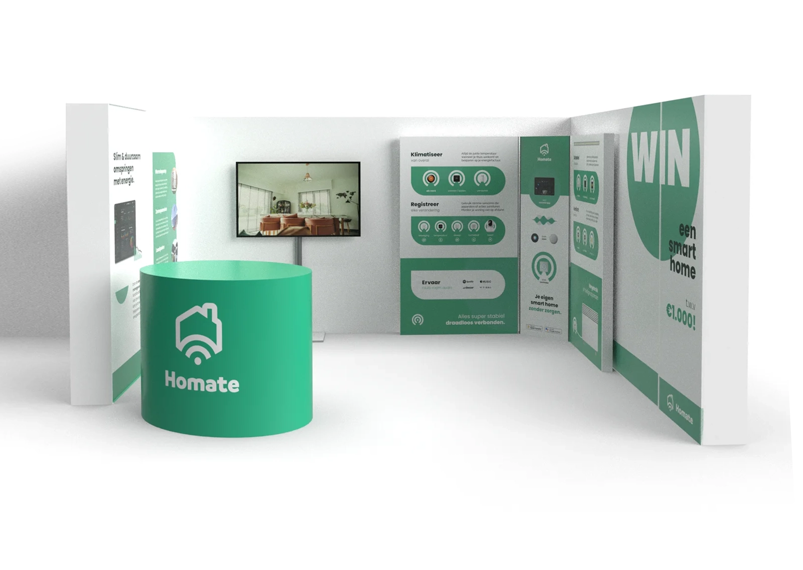
We build your brand whilst we build your website.
The Street Food Company already had a brand, lived in the work and never written down. Building the site is simply what pinned it in place. Tell us what you are building, and we will make sure it stands on something solid.