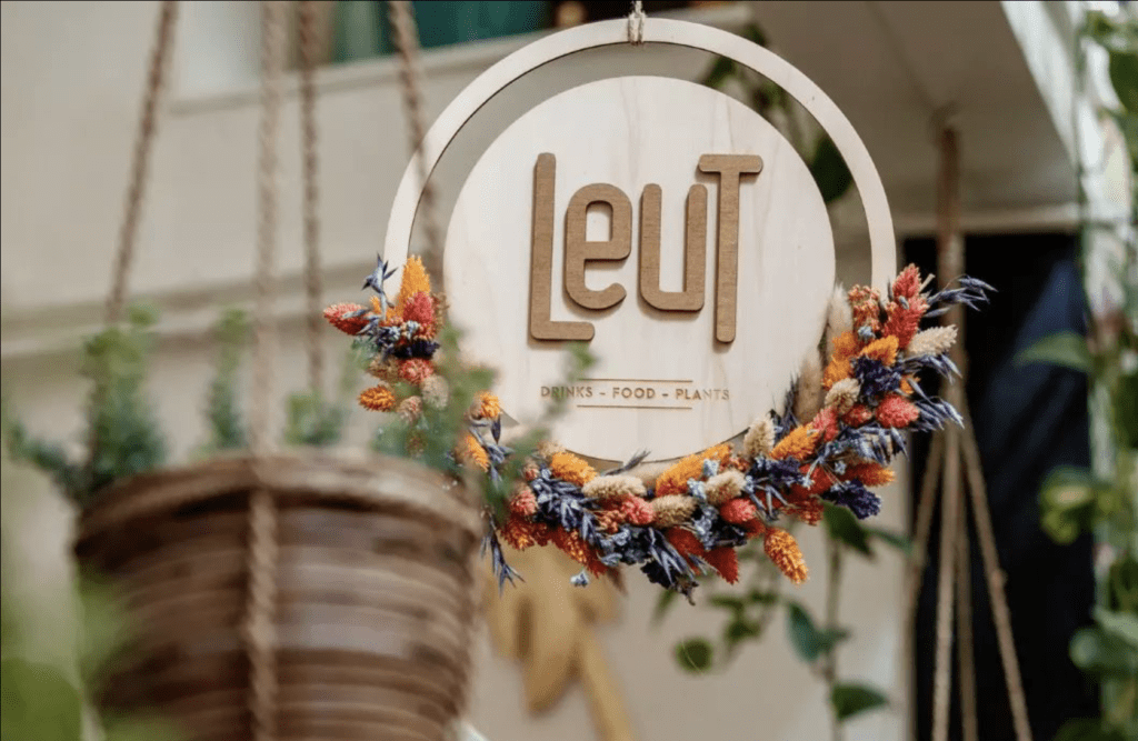
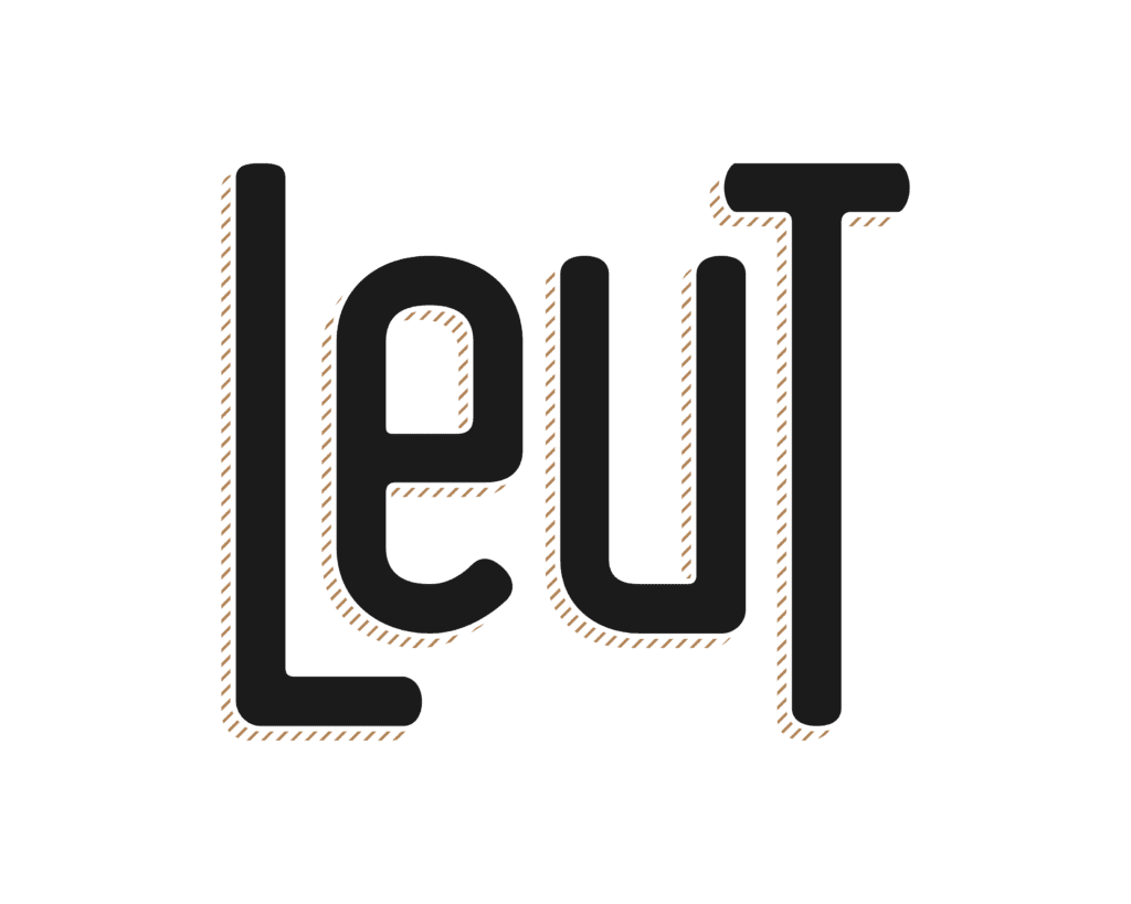
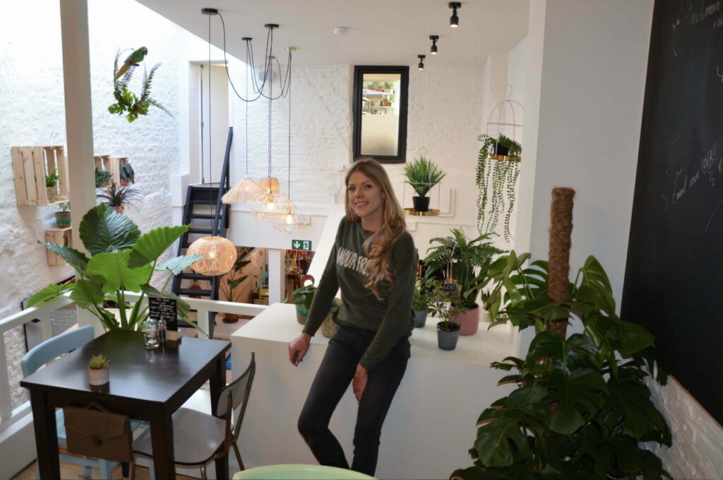
Coffee places are a hot topic, so are plants. Farah decided to combine both of these passions into one concept. Throw some excellent food into the mix and “Leut” — a synonym for coffee and pleasure in Dutch — is born.
Personal tone of voice.
Farah approached us for a casual logo design, but when she saw what we had to offer, we started a long-standing partnership. We help her with graphic design and numerous consumables that a well running establishment like Leut might need. To keep it personal, managing Leut’s social media channels is something she prefers to do herself. When developing marketing pieces, we try to keep the personal touch in the copy so that a consistent tone of voice is achieved across the brand.
Local stronghold
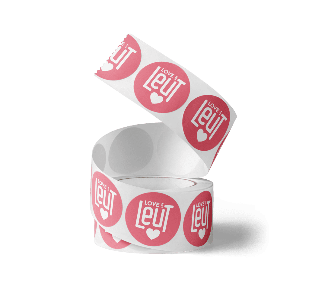
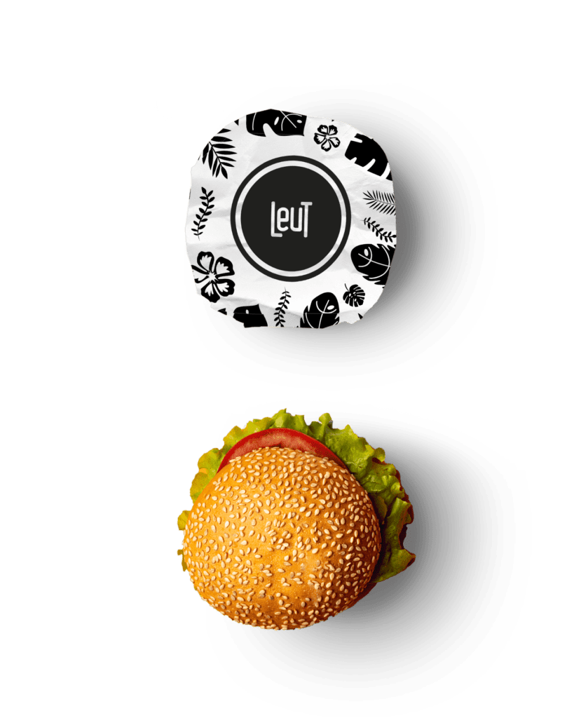
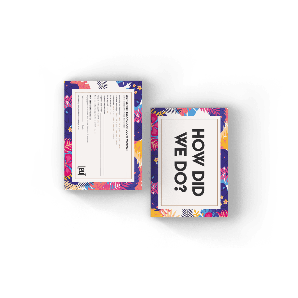
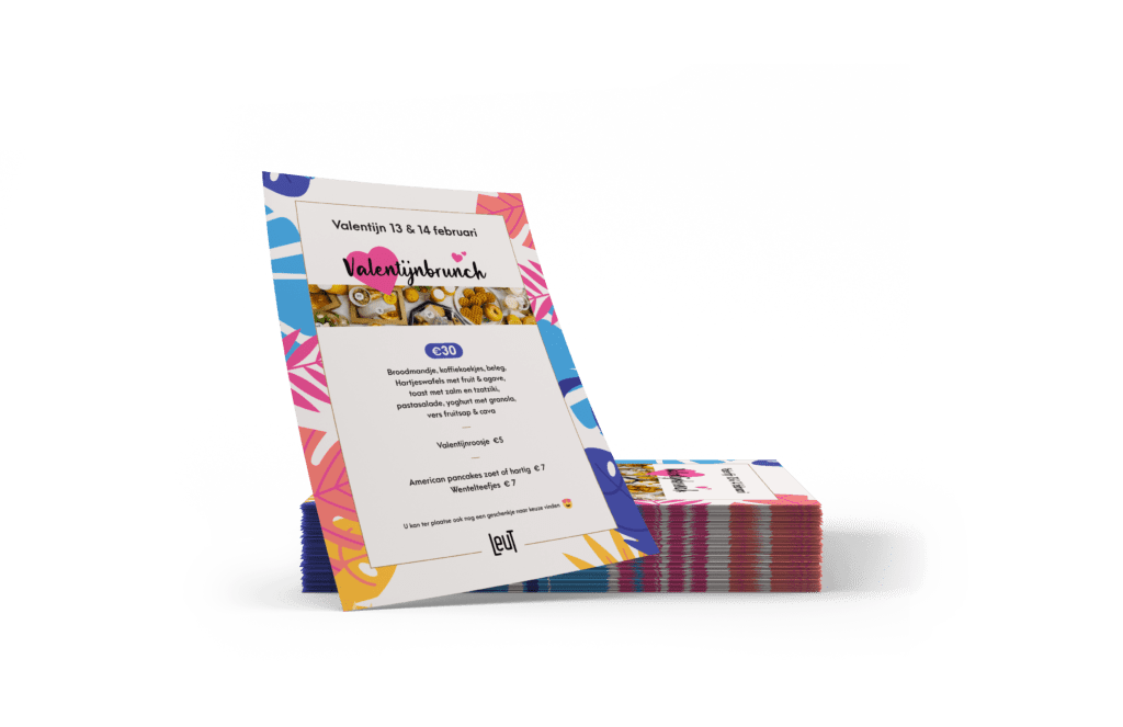
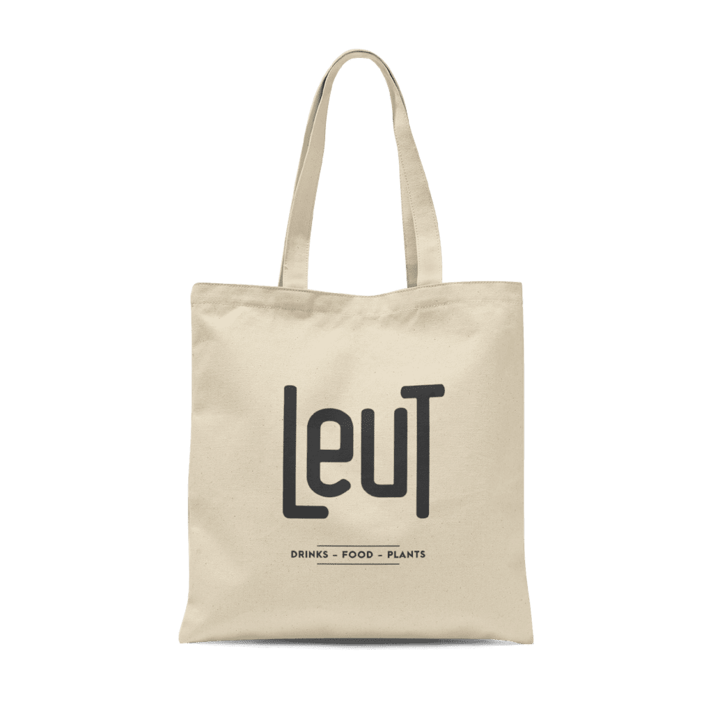
Invitations, flyers, food packaging, stickers and tote bags are just some of the things we have designed and printed for Leut. All these pieces — in addition to a super friendly staff — have helped Farah to build a strong brand that is well known far beyond the borders of home city Lokeren.