Every product is its own project.

Final Nutrition
Ghent
2022 - now
Sports nutrition
- Brand design
- Logo design
- Brand guide (living)
- Packaging
- Print & signage
- Campaign / launch
- Content creation
A Belgian brand with a range that keeps growing.
Final Nutrition is a Belgian sports-nutrition brand. It sells through its own webshop and on retail shelves, and the range keeps getting wider.
Supplement packaging carries its own rules: claims, mandatory panels, legal text in three languages, and the hard limit of what a printer can actually hold on a curved wrap. The brand knows exactly what it wants on the shelf, and we know what it takes to get it off the press.
Vertical on black

Horizontal on white

Horizontal on black
Bebas Neue
Regular 400 (all caps)
- Display68px · 400PREMIUM SUPPLEMENTEN VOOR PREMIUM SPORTERS
- Heading32px · 400ULTIMATE PRO MIX FORMULA
- Body base16px · 500Open Sans underneath, because a nutritional panel has to be readable at four point on a curved surface before it has to be beautiful.
“Can every product just use the same template?”
Close, but the template is not where the difficulty sits. A range has to read as one range from three metres away, and still let somebody pick the right tub from thirty centimetres. Those pull against each other. Lean too far into variety and a shelf of twenty-four products reads as twenty-four different suppliers, which on a supplement shelf reads as cheap.
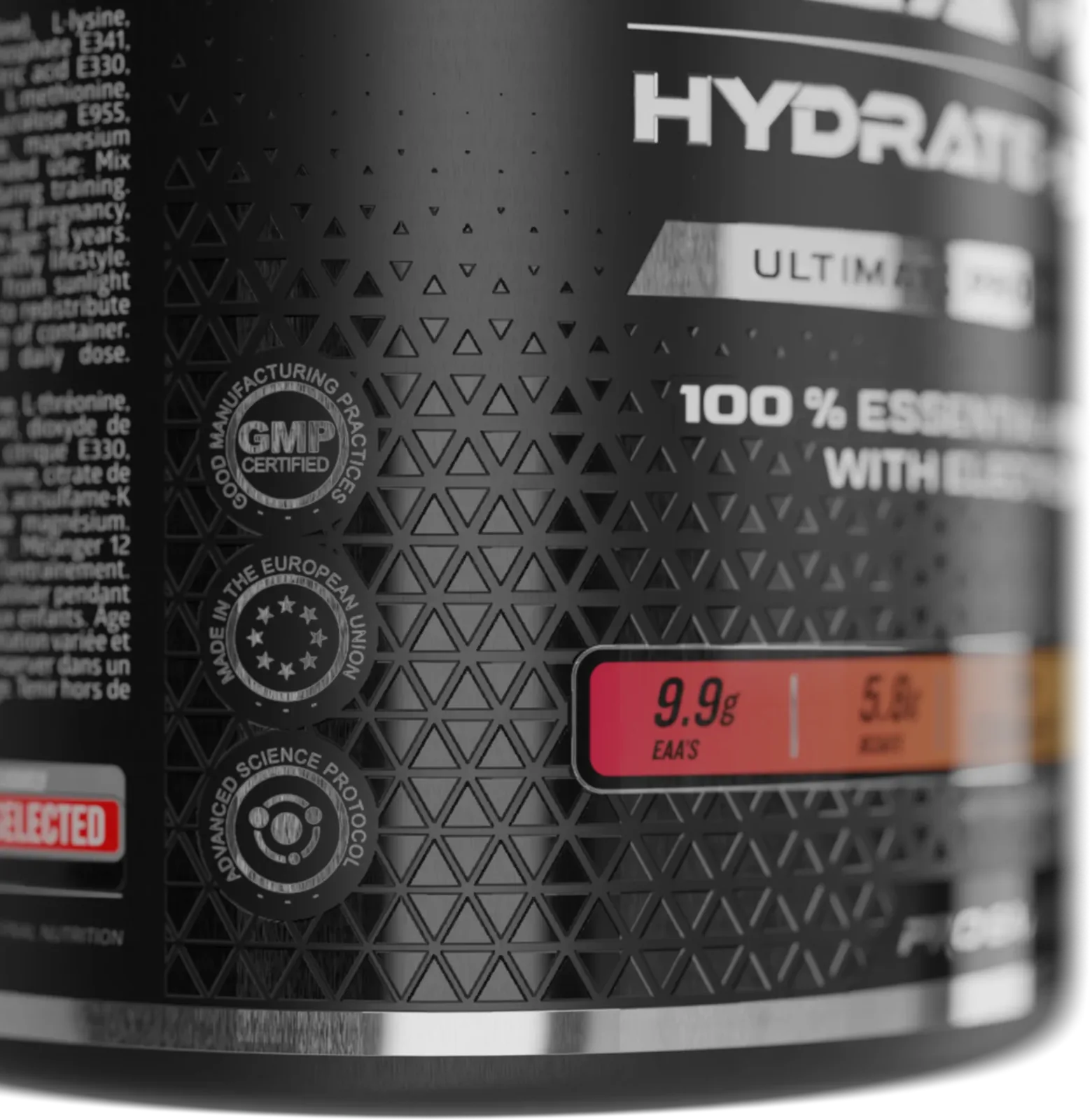
The second problem is physical. The labels lean on special print finishes, and those are print decisions rather than design decisions. They go wrong quietly: a file that looks perfect on screen comes back from the printer with a muddy varnish or a pattern that moiréd. Somebody has to know what survives the press before the order goes out.
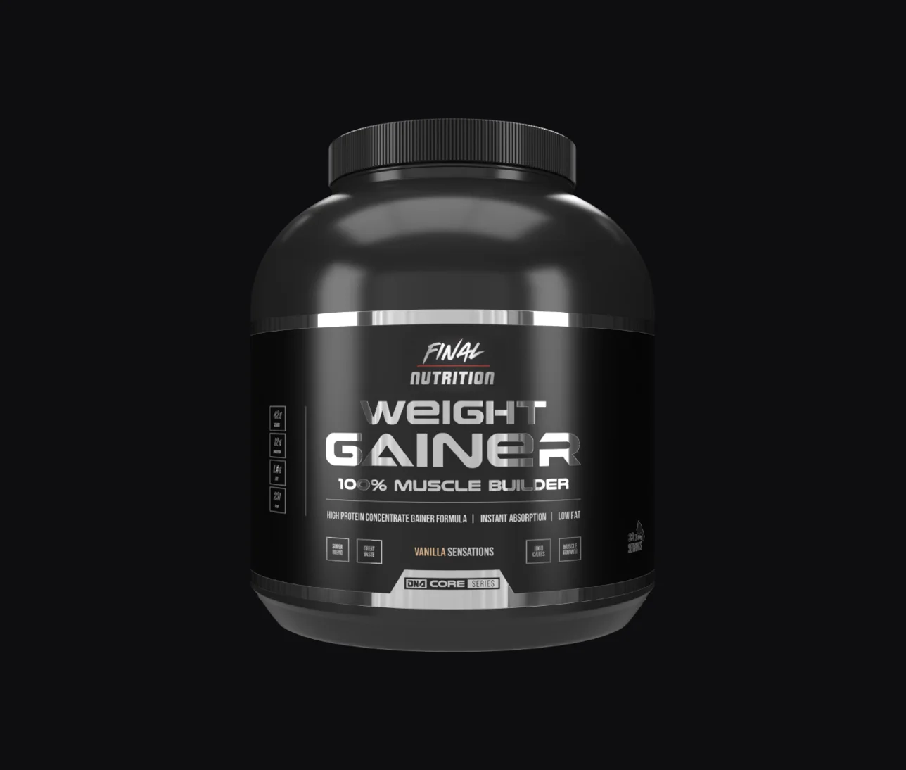
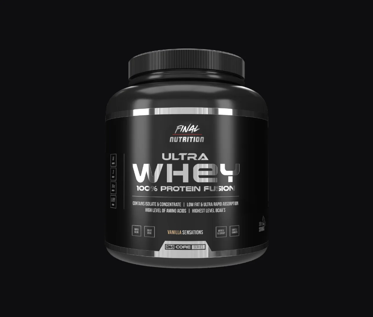
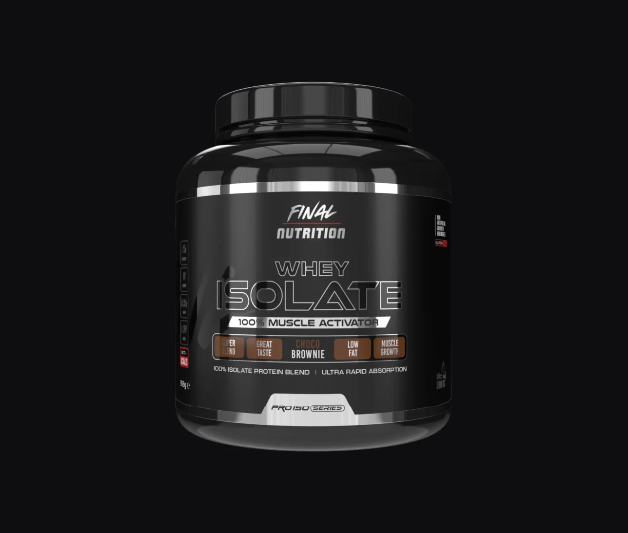
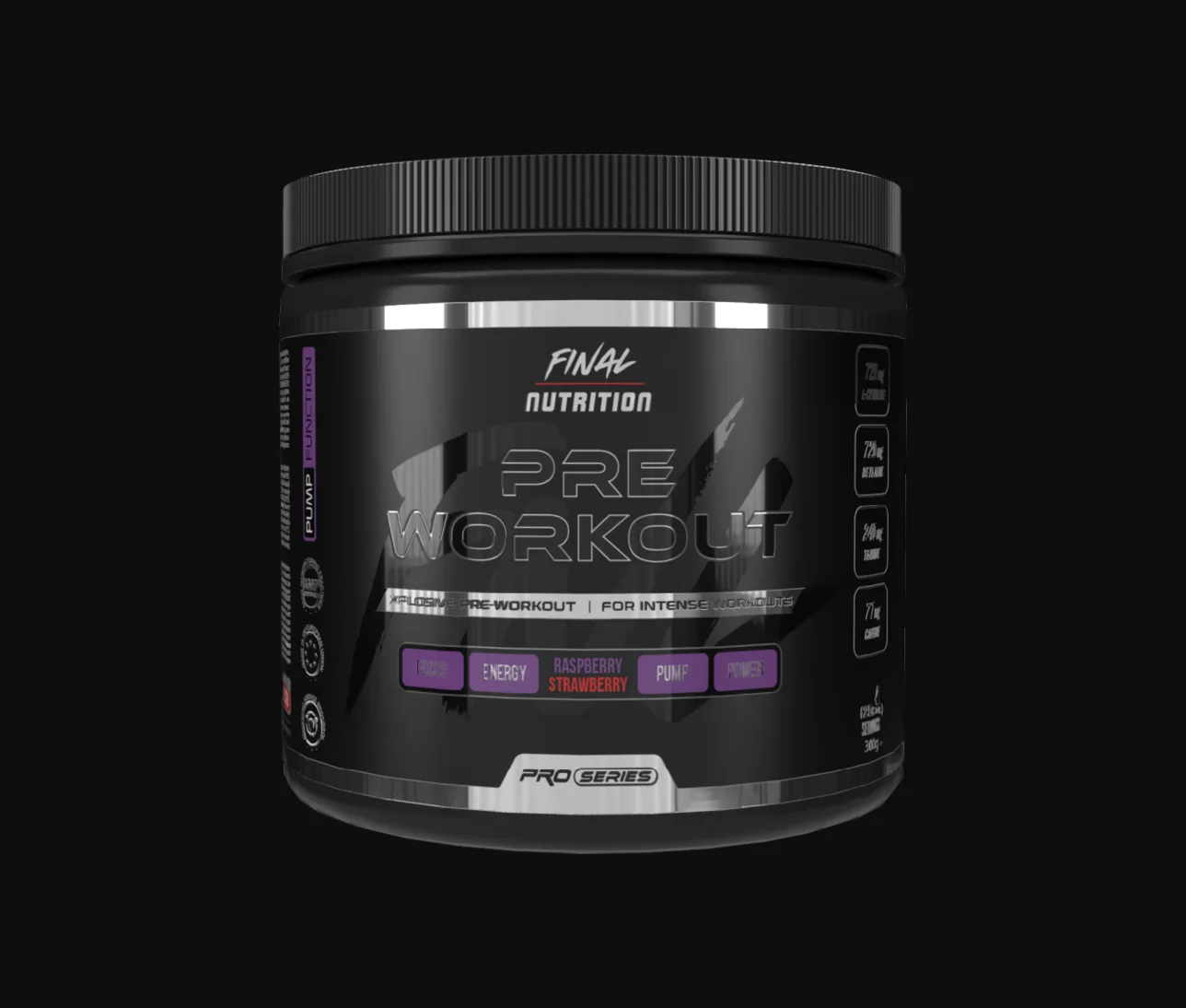
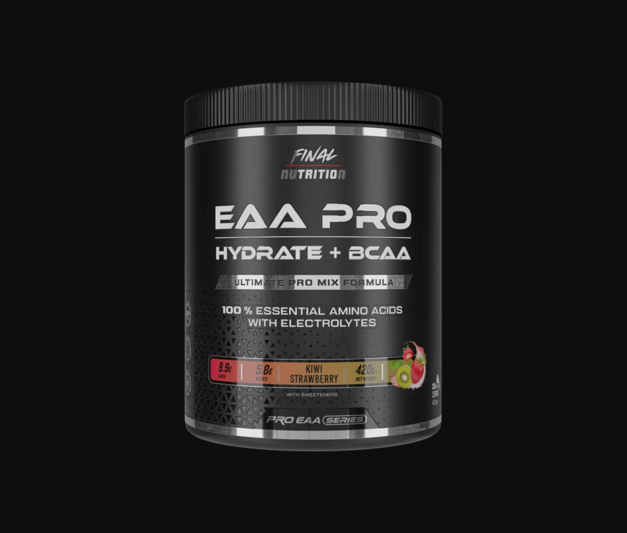
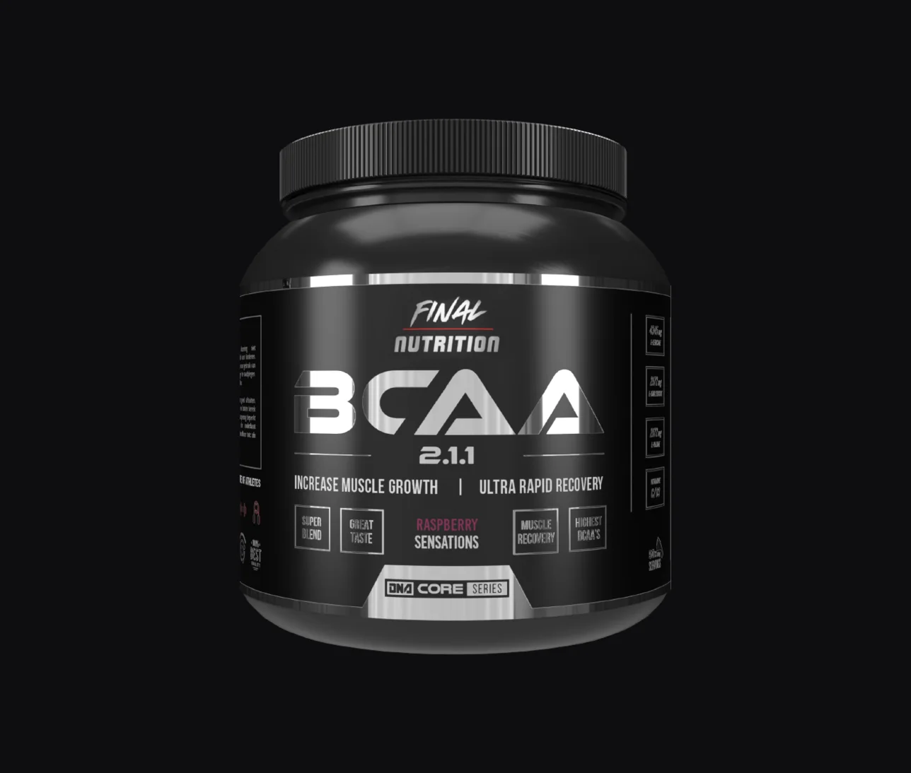
One architecture, and only the front panel moves.
Every label is built on one architecture: the mark at the top, the product name across the full width, the claim strip, the flavour bar, the series badge at the foot. Same black, same brushed silver, same finish, same silhouette, whether it is a 400g pre-workout or a 2kg gainer. What moves is the front panel information: the name, the claim, the flavour and its accent colour. Enough to find the right tub, never enough to break the family.
Uniformity is the premium signal in this category. The brands that look expensive on a shelf are the ones where every tub is obviously the same object in a different size. The ones that look cheap are the ones where each product was drawn on its own.
The finishes are the part nobody sees us do. Every label goes out as a pre-press file with the special finishes on their own separated layers, mapped to what the printer runs. That is why the texture reads in the hand rather than as a grey smear, and it is the reason a fourth reprint still matches the first one.
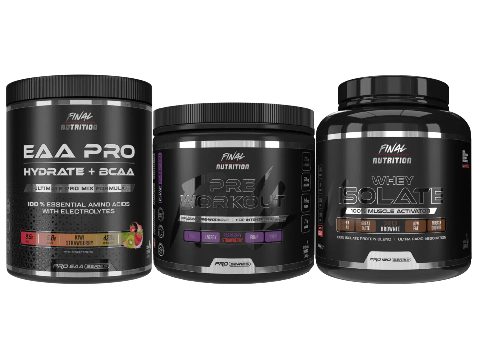
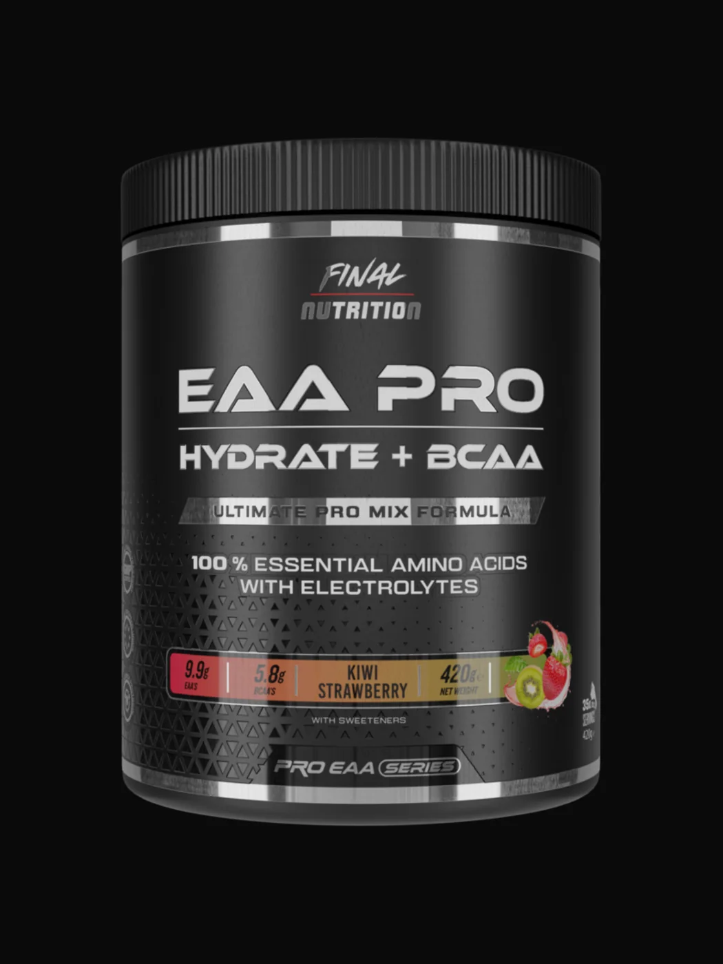
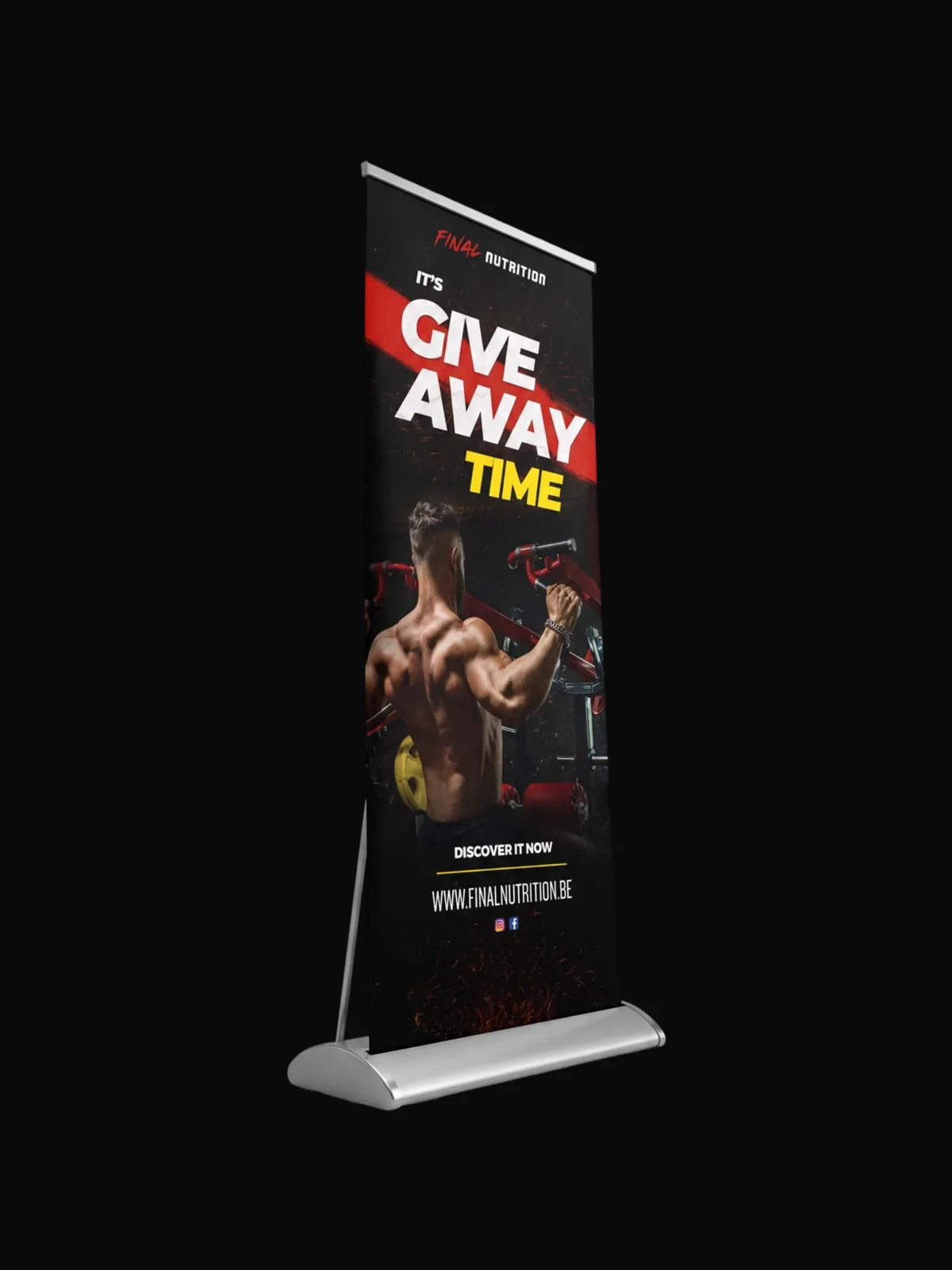
The brand experiments with AI, we make sure there is something worth feeding it.
They like to experiment, and lately that means ChatGPT: generating promo images, trying angles, seeing what comes back. We are not going to pretend that is a threat, because what actually decides whether those experiments look good is the input.
So we build the input. Every product now has a full 3D mockup kit: the label wrapped on the real container in Blender, lit, shot from several angles, exported cut out on transparent. Hand a generator a proper render of the actual product and it has something true to work from. Hand it a flat label scan and it invents a jar that does not exist. The renders are the reason those experiments come back looking like the brand instead of like stock supplement imagery.
The same kit does the unglamorous work too. Those renders sit on the webshop, in the retail display artwork, in the campaign banners and in the seasonal promos. One asset library, many places, no reshoot.
When AI can’t cut it in the real world.
Generating an image is easy now. Getting something printed, cut, sewn and stood up in a shop is not. These are the asks that had to survive a production run, and every one of them came back to us.
- 01
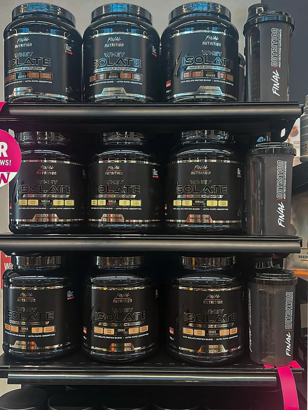
“We’re gonna sell with retailers now.”
We assisted them with shelf displays when they started selling through retail.

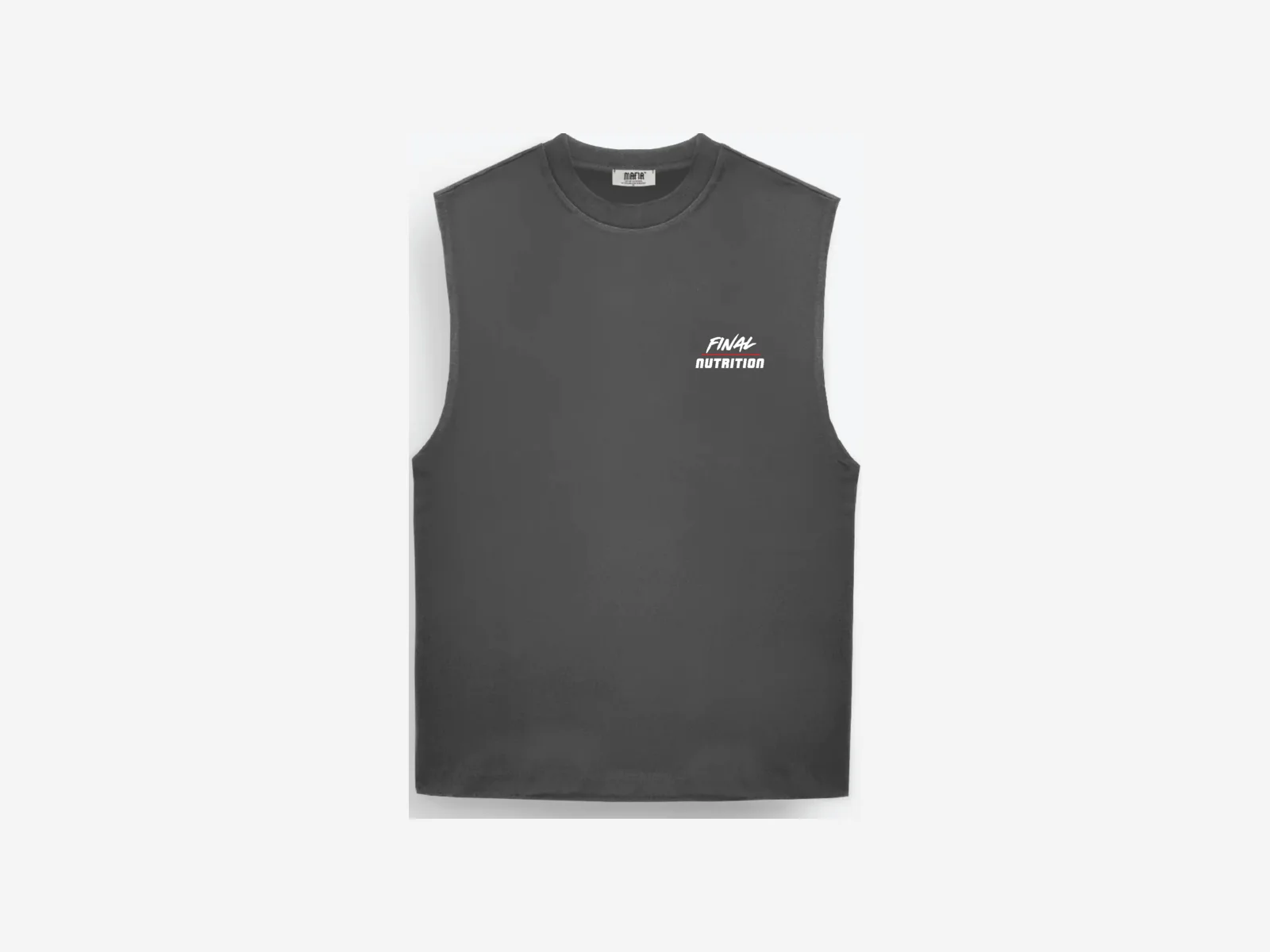
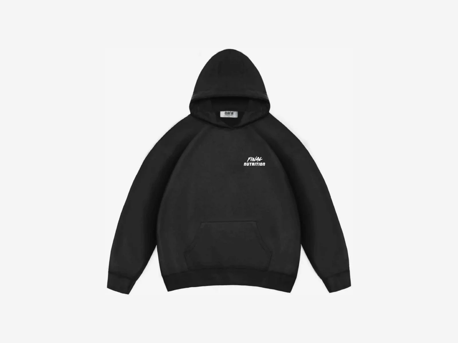
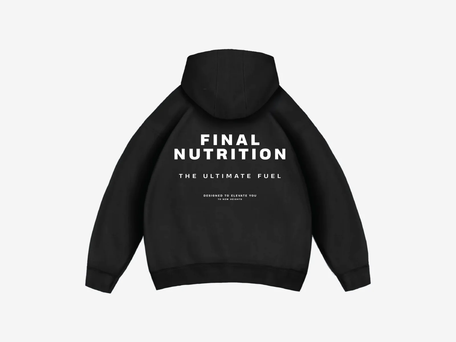
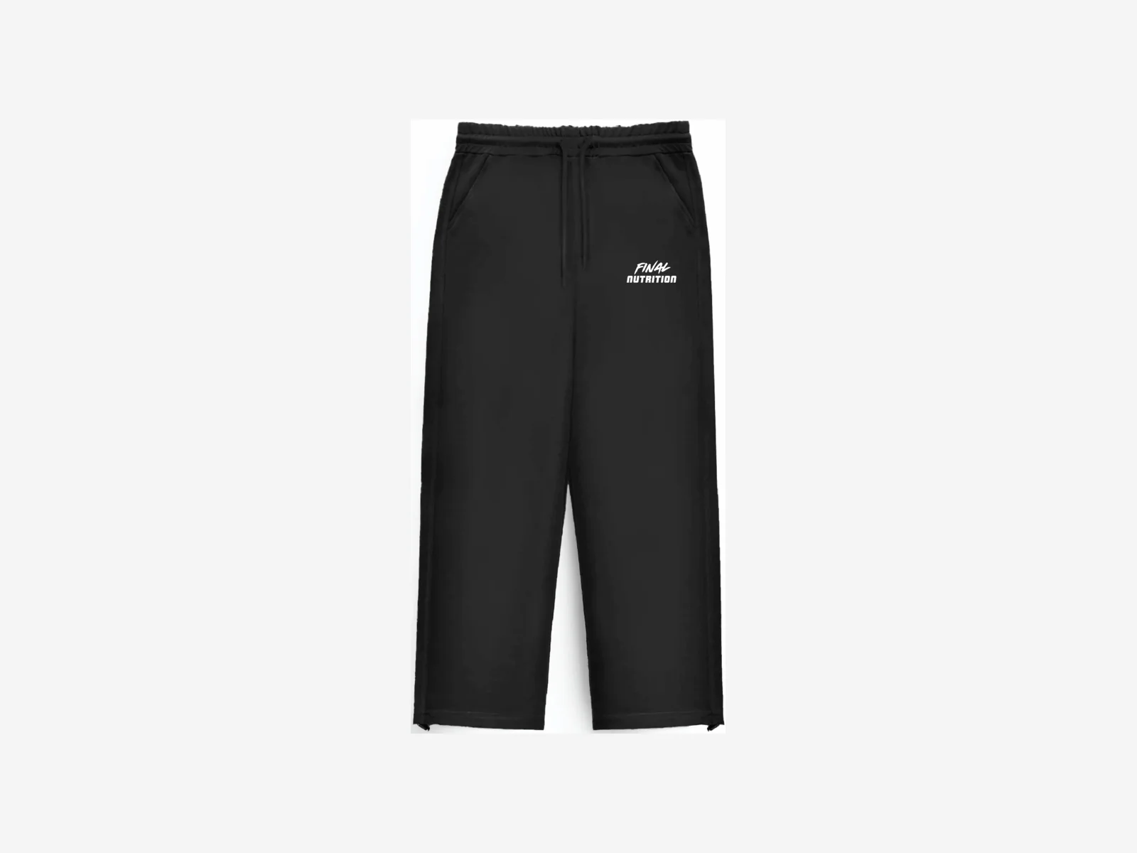
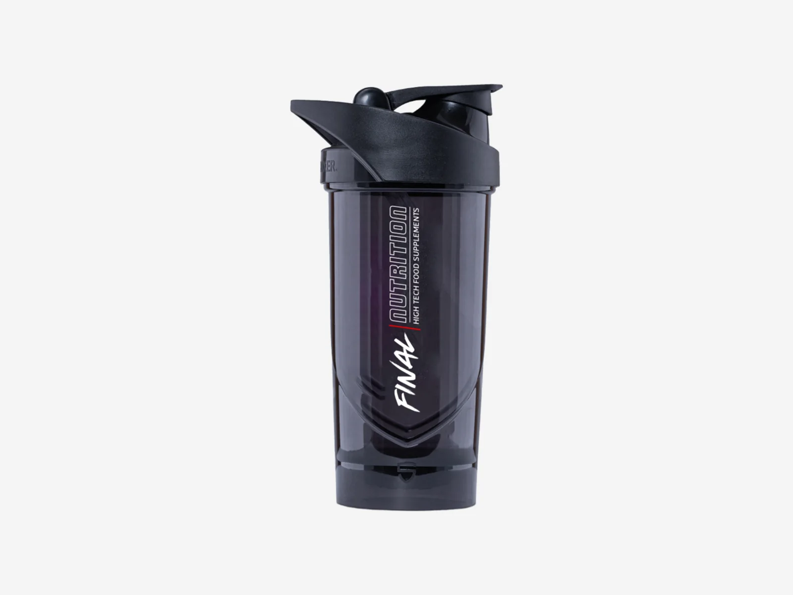
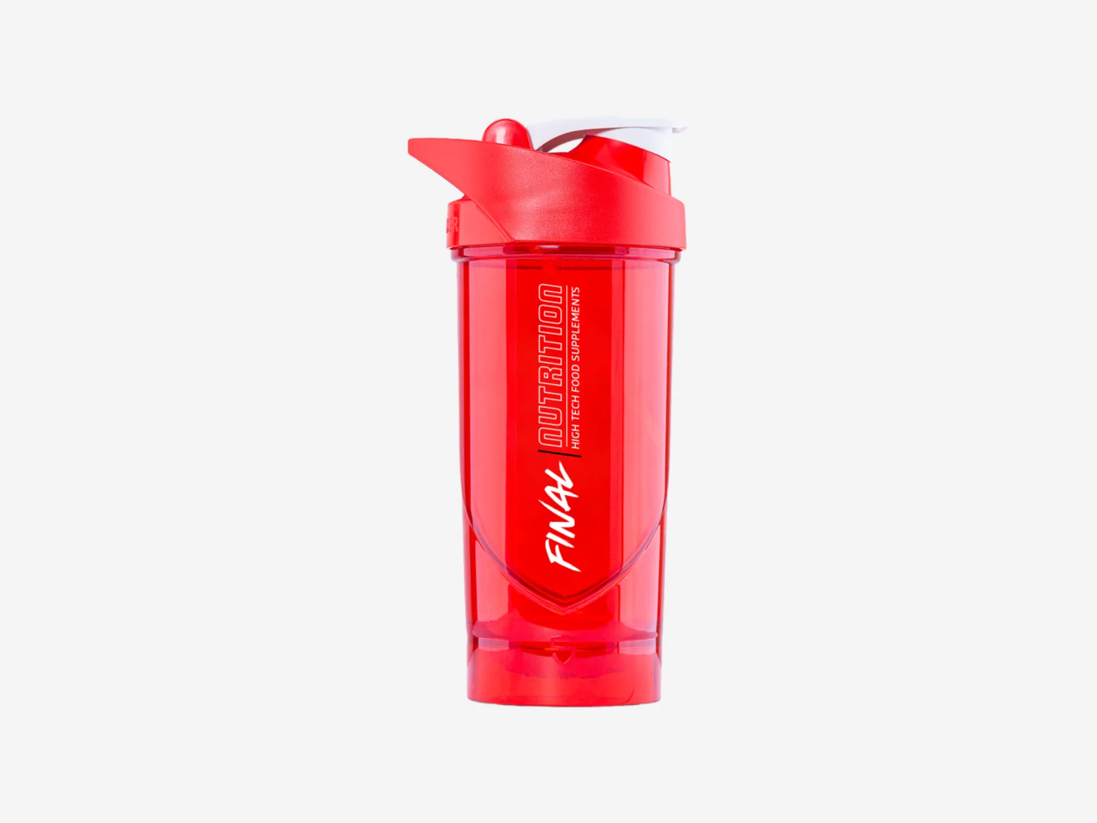
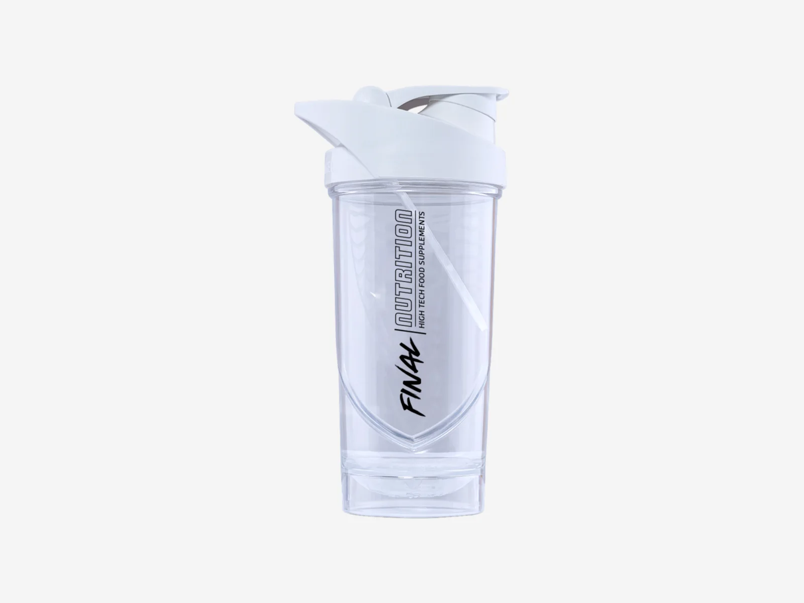
“Can you make some merch sketches?”
We sketch it, then take it to press: artwork, placement, and files the supplier can run.
A range that has to grow without going flat.
A range like this outgrows a template, so we built a system that lets every product look different and still look like the brand. Tell us what you keep having to make more of, and we will build the part that makes the next one easy.